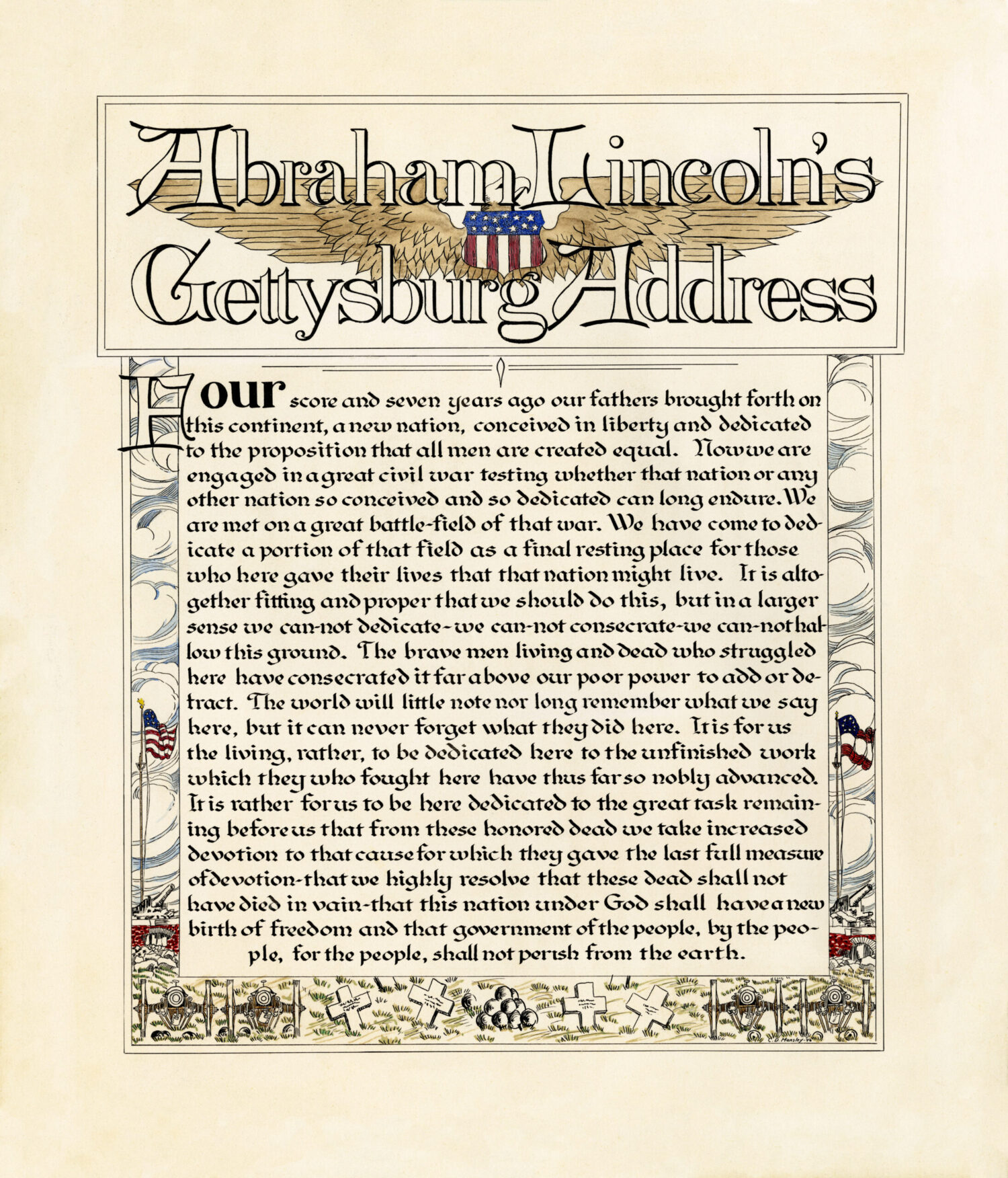
Calligraphy on Calfskin #2

And this my friend is the companion piece to MERCY, in my last blog post. It is The Man in the Arena, a famous speech that Theodore Roosevelt gave April 23 at the Sorbonne in Paris, 1910. Whether you agree with Roosevelt’s politics or not, his speech is an inspiration. In my mind, it’s about getting into the battle of life rather than sitting on the sideline. Making an impact for good in your country. To me, it is incredibly relevant in today’s world. (In the image below, you can see how I mount the calfskin for framing. These skins move with the humidity, so the threads are mounted like little springs that help to stabilize the skin in differing humidity.)

This design was created from approximately one third of the skin (the other two thirds used on the MERCY piece in my previous Blog post). To prepare the skin there are special grades of sandpaper used to smooth the surface and to remove oils. Then you pumice the surface and brush off the residue. Look closely as the images and see if you can see the beautiful texture of the skin.

Although you see the layout for my MERCY piece (above), The Man in the Arena calligraphy was lettered on the right (blank) side of the calfskin. It’s always nerve wrecking to cut these large expensive skins as I never want to make a mistake in measurement…but all worked out well!

Here you can see the famous title. My client requested that the design be straightforward, legible and not too fancy. As a lettering artist, I try to make it interesting. by using a unique style for the title and adding flourishes to give it flair. In my mind, the flourishes show the movement of a ‘man in the arena’ and they highlight the two nouns. I had a different lettering style on the line “It is not the critic who counts” and didn’t like it, so with my handy electric eraser I was able to remove the ink. Then I lightly sanded the area and put in the new line (Italic). Calfskin is so wonderful if you need to make a correction. Better than paper.

Gold leaf never shows well when you scan or photography from head on. I typically have to photograph at an angle to catch the glint of the gold. To tie the two designs together, I used the same Bookhand style for the main body, the same crimson color and gold leaf, but changed the titling style. This lovely lettering style was in an old Speedball textbook, but some of our modern scribes have updated it so that it’s better than ever – see the newest Speedball text book.

And here are the two finished designs together. I framed them with a black carved frame, linen top mat, crimson accent mat and a black beaded wood fillet in the inside window of the mat. Note, that calfskin never lies completely flat, but that is the beauty of it.

Fantastic Flourishes Workshop

This gallery contains 7 photos.

June 4-5, 2022 – 10-5 EST – Instructor Holly Monroe – Online My second Fantastic Flourishing (broad-edged pen) workshop is coming up. Some have asked, why in the world do calligraphers flourish? Well now, that’s a good question to ask. There is just something about beauty, something about decoration and detail that delights the eye. […]

POINTED PEN VS. BROAD EDGED PEN CALLIGRAPHY

When I ask a client if they have a favorite lettering style, they often answer “I want calligraphy”. As I have learned, calligraphy is the umbrella word for lettering created by hand. It is defined as “the art of beautiful writing” and it encompasses many different lettering styles. That said, when a new student comes along and wants to learn ‘calligraphy’, I ask them, do you want to start with the pointed pen or the broad-edged pen. Many don’t know how to answer. They didn’t realize that there are two different basic types of pens that they can start with.

“Ostinato” in stylized script and “Love” in the Old English style on a handmade ‘paste paper’ background

When I was in high school, my father, Cliff Mansley, Sr. a former Zanerian student, started me off with both. I began learning Engrosser’s Script with the pointed pen and Old English with the broad-edged pen. The pointed pen that I use is known an oblique pen holder, (sometimes called an elbow pen) it can hold a variety of different pen nibs. April 23, 24, 30 and May 1, 2022 I am teaching a Pointed Pen Pizazz workshop – stylizing your lettering and flourishing via The Gentle Penman . Please sign up and join us, even at the last minute! I find that having a variety of these holders is helpful. I began with one, but because pen nibs come in various sizes, I soon purchased (or inherited) others. This way, I can keep the nibs that I frequently use, each in their own penholder. Below is a picture of a few of my oblique holders. From left to right: Sull pen, Hourglass Adjustable Oblique (you can tighten or loosen the screw) from Paper & Ink Arts, Đào Huy Hoàng pen made the pink/ivory pen from “Holly” wood (that’s why I bought it!), next a Bill Lilly pen gifted from David Ogden, 3 Zanerian pens (light wood from my father, dark wood from Steve Ziller, black plastic Zanerian). I should buy one of Heather Held’s beautiful handpainted holders to enhance this photo!

Pointed pen lettering looks something like this….with many variations!

The broad-edged pens that I use are in the picture below. I love to use the wooden double-ended holders because the Mitchell pens that I use are labeled 0, 1, 1.5, 2, 2.5, 3, 3.5, 4, 5, and 6. I can use 5 holders which keep all 10 pens at the ready for me to use daily.

Broad-edged pens
Mitchell pens in double ended wooden holders. Purchased through John Neal Books.

Below is a sample of broad-edged lettering. In this case, Italic. I’m teaching 2 Fantastic Flourishing workshops (with the broad-edged pen) this Spring 2022. One in Albuquerque and the other in Pittsburgh. Pick a class that fits your time zone! That first link goes to John Neal where you can buy supplies. You can also go directly to Escribiente for the Albuquerque workshop or to Karen Roberts, Karigraphy@gmail.com, for the Pittsburgh workshop. Keep reading….

Finally, I have a wonderful turntable pen/brush holder, so that I can easily find my pens. Note that I have labeled the sizes, for easy retrieval while I’m working. May God bless your life and I hope to see you in an upcoming workshop!

SpeedBall Textbook 24th Edition, Celebrating 100 Years

It’s Easter, and I’m late with this news, but last November 2015, just after I moved from Ohio to Oregon, the Centennial Edition of the Speedball Textbook, A Comprehensive Guide to Pen & Brush Lettering, 24th Edition, finally hit the market! Yah! My father Cliff Mansley, Sr. and I are both honored and grateful to be included among so many accomplished and inspiring lettering artists. I snapped a photo of our pages below and offer you a brief description, plus links to purchase the book.

Speedball Textbook, 24th Edition in which Holly Monroe and Cliff Mansley are both featured.

Holly Monroe and Cliff Mansley, Sr. showing off the cover of the 2015 Speedball Textbook, 24th Edition in which they are both featured.

For a little $15. book the Speedball Textbook, 24th Edition packs a big punch. Students of the written word can see a wide variety of lettering styles as well as fabulous finished examples from contemporary calligraphers of today. The added bonus in this edition, edited by Angela Vandalis and Randal Hasson, is that it salutes lettering throughout the last 100 years.

Speedball Textbook 24th Ed, Cliff Mansley calligraphy of I Corinthians 13

Love bears all things from I Cor 13. Cliff Mansley’s calligraphy in the Speedball Textbook, 24th Ed.

In the front you’ll find a fold out page featuring the covers of 24 past editions of the Speedball Textbook. It moves on to Tools, Tips and Techniques, lettering styles through the ages (pointed pen, broad-edged, brush, hand drawn, etc.), commercial lettering and so much more. If you’re a lover of letters you’ll want a copy! Order from www.JohnNealBooks.com or www.PaperInkArts.com two small businesses that cater to the Lettering and Book Arts community.

Speedball Textbook 24th Ed with Cliff Mansley flourished title

Bottom right: Flourished title of a poem about Scout Leader’s Wives. Lettering/Flourishing by Cliff Mansley, Sr.

Speedball Textbook 24th Edition featuring Holly Monroe's flourishing instructions.

Holly Monroe’s mini-course in flourishing appearing in the Speedball Textbook, 24th Edition, 2015, page 55. For a more comprehensive weekend workshop, FANTASTIC FLOURISHES, contact Letters@HollyMonroe.com.

Calligraphy Cruise February 2016 to the Western Caribbean

2016CalligraphyCruise_WEB


Come join me and others as we sail to the Caribbean for fun, sun and to enhance your calligraphy repertoire of skills. Calligraphers and NON-Calligraphers, all welcome -Friends and Relatives, spouses and significant others. We are changing cruise lines this time to Royal Caribbean as Holland America sold out the route and week we initially chose. Details are on my flyer above, which can currently be seen on my FB page and in the SHOP on my website. Correct information will soon appear on my CLASSES section. The wrong date is on my Home page and will be corrected. The correct sailing dates are February 20-27, 2016.

                              $100 deposit will hold your place in the class.                             Book early for best cabin selection.