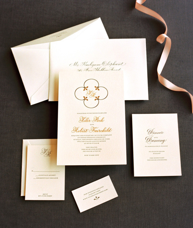
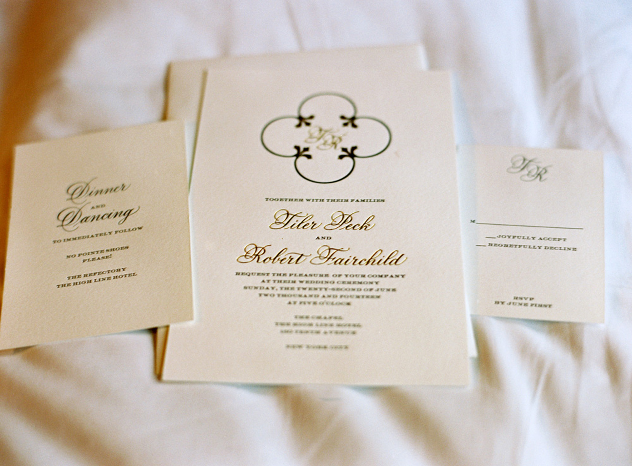
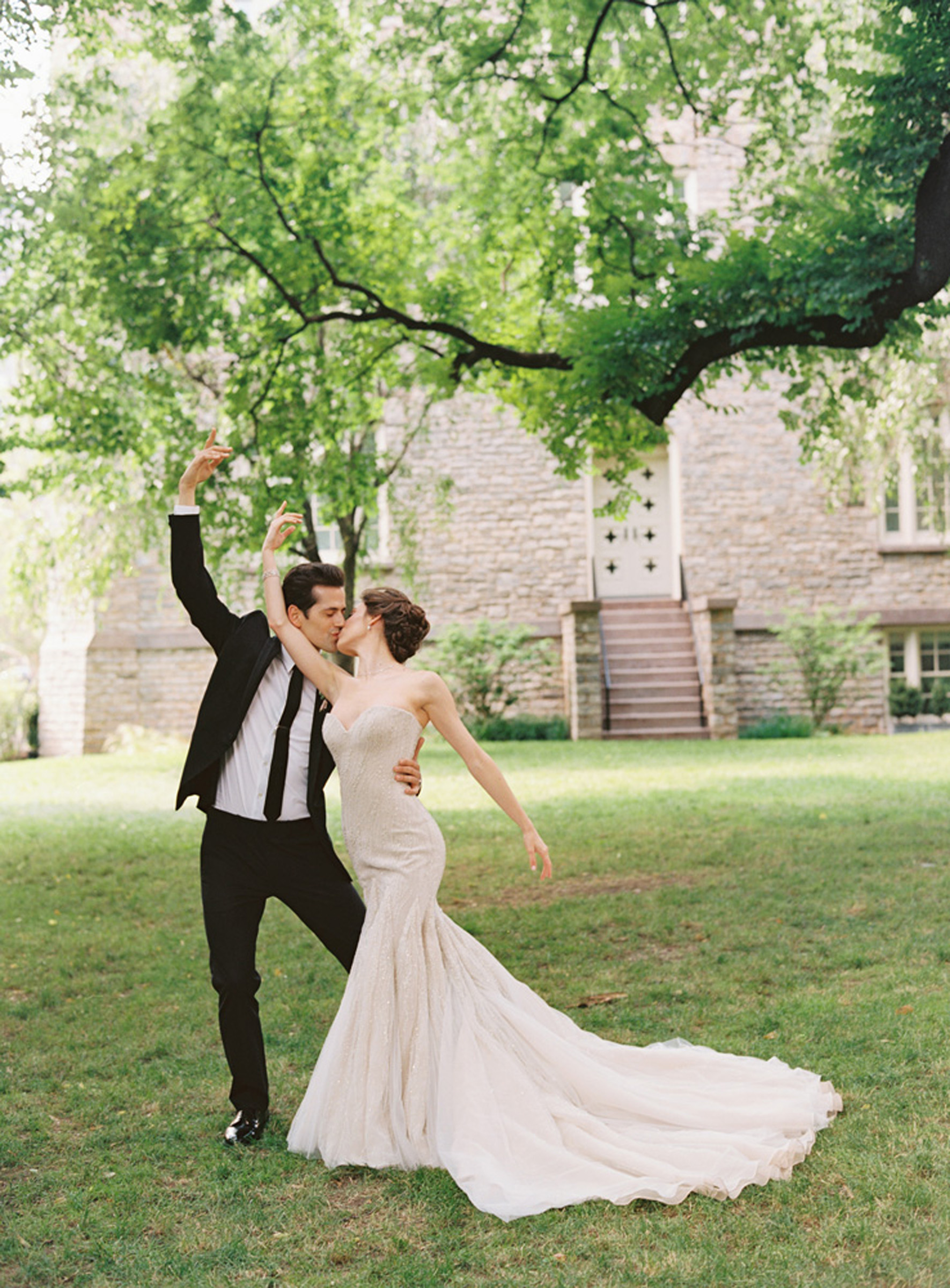
Last year, I was sitting at the drawing board, when Sue Corral called from www.DesignCorral.com She had been at a speaking engagement in NYC, when the Martha Stewart Weddings people asked her to design the stationary for “The Ballerina Wedding.” Tiler Peck and Robbie Fairchild, the two principal dancers in the New York City Ballet, were getting married! Willingly, she submitted samples from several calligraphers to the ballerinas, and unbeknownst to me, mine had been selected! Tiler and Robbie wanted lettering that was traditional, tailored and elegant. I was honored. So Sue and I put our heads together to come up with something special. Sue, had the design reigns and sent multiple mockups, but the ballerinas had simple, elegant taste. They landed on one, that incorporated the motif from the Cathedral floor in the picture below. Enjoy the professional pictures taken by Photographer Charlotte Jenks Lewis, www.charlottejenkslewis.com

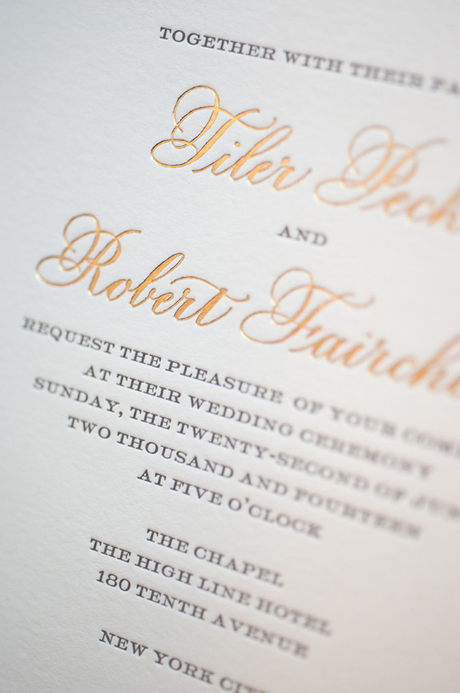
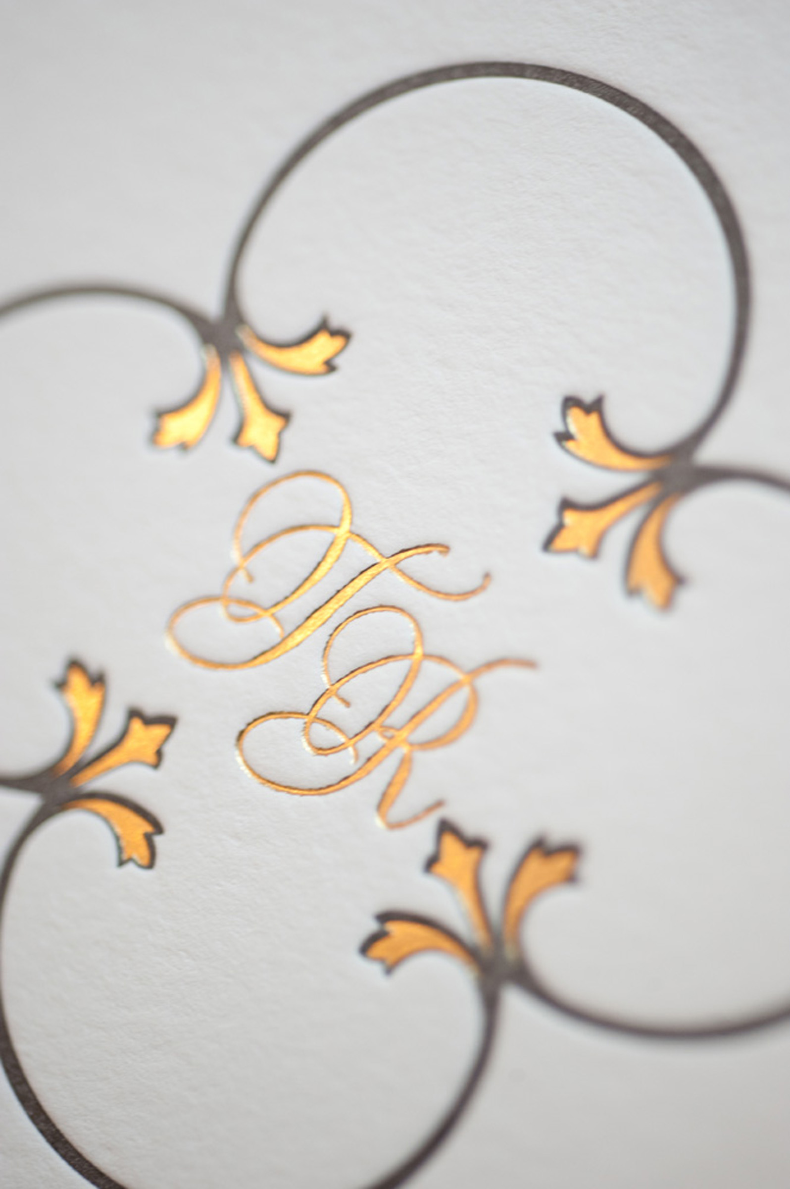
Both the lettering and the tri-floral ends of the design were letterpressed in gold foil. Originally, the calligraphy was created in black…
 Letterpressed type and “Dinner and Dancing” calligraphy was charcoal grey.
 I am sharing a close up with you….one might think that the gold lettering is typeset, the letterpress makes it look soooo perfect. But no, this was all done by hand at the drawing board, retouched in Photoshop and digitally transported to Sue. The calligraphy was much more delicate than it shows here. If you are not familiar with letterpress, the process always thickens the intended fine lines.
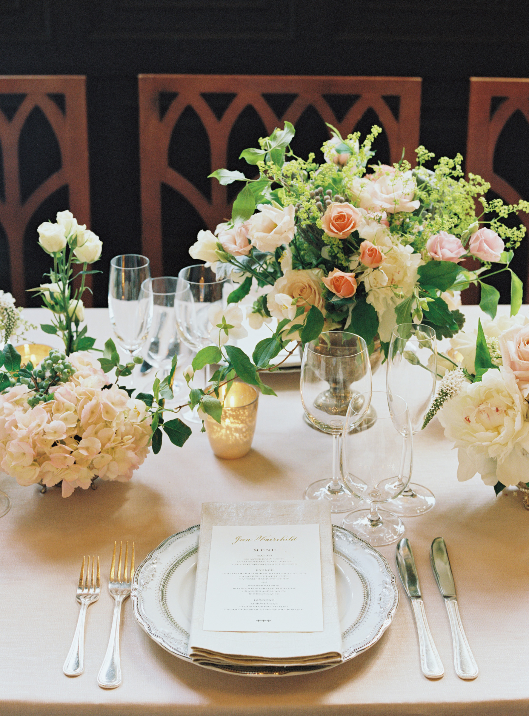
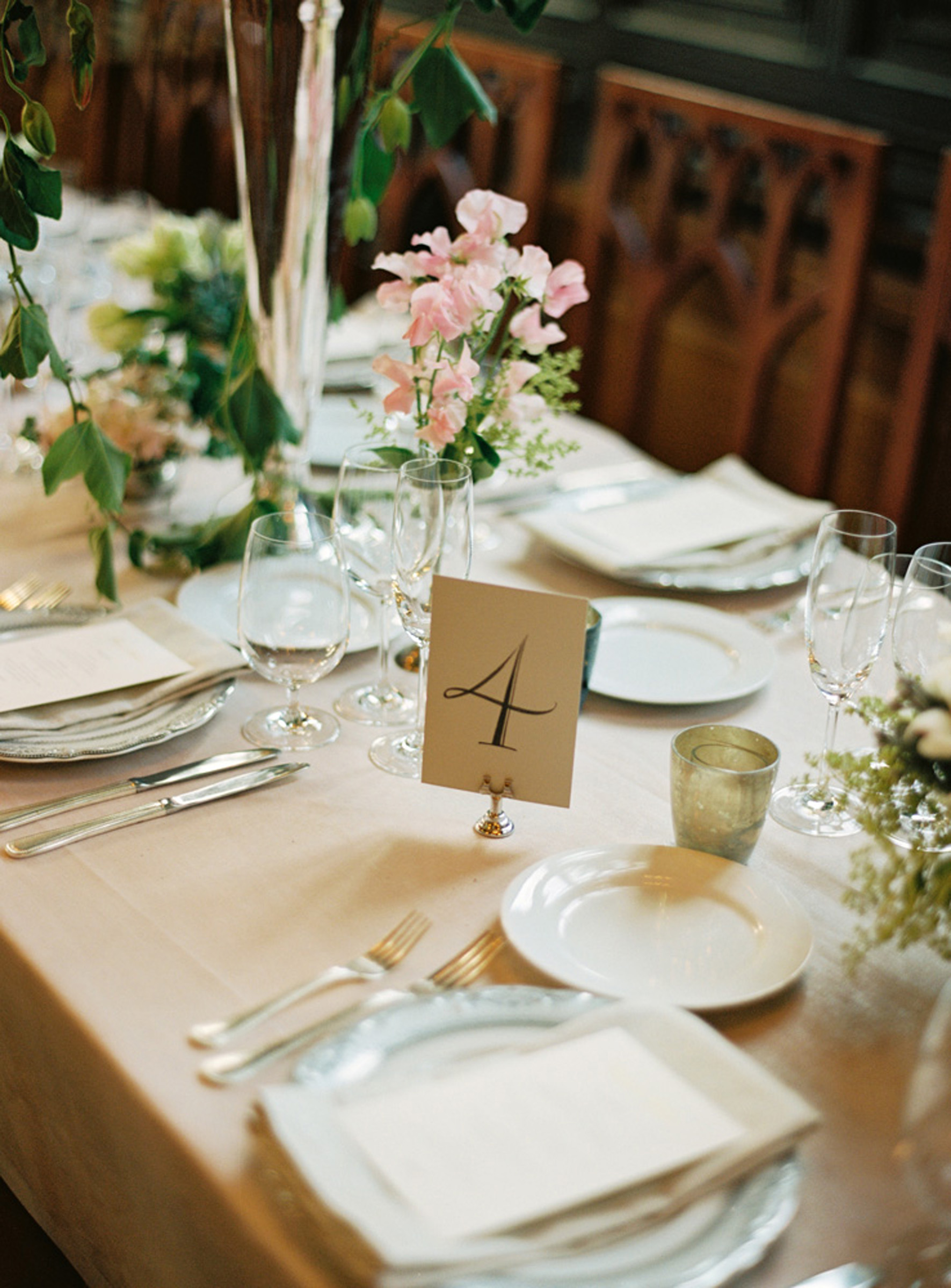
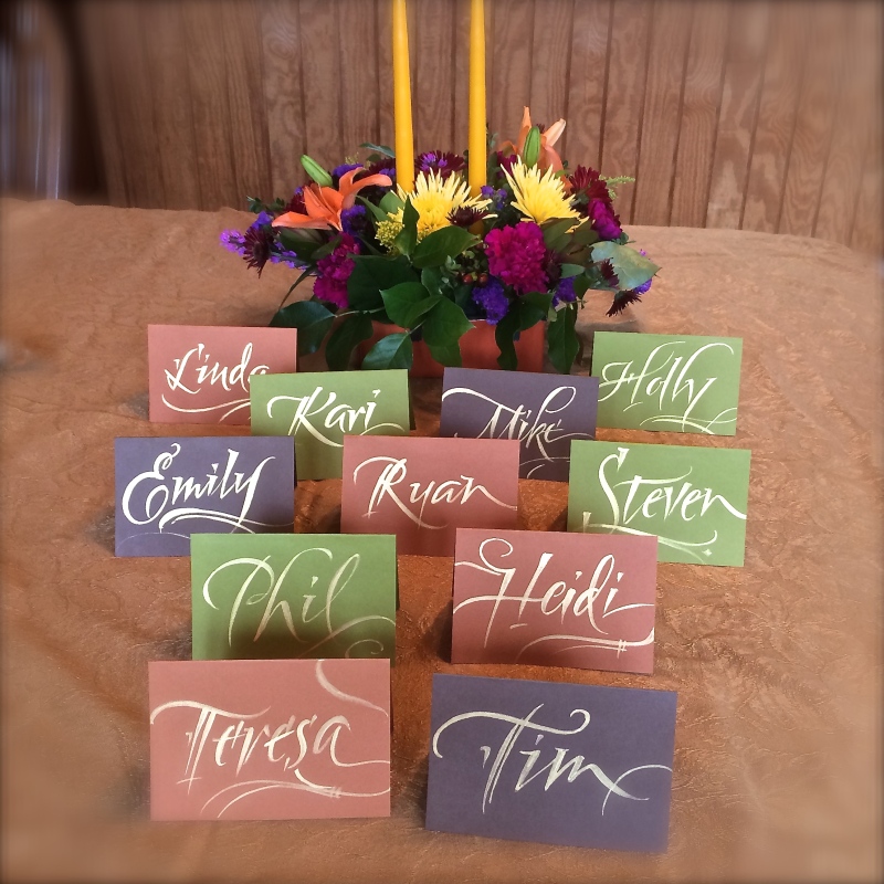
 Menu’s were letterpressed via Sue, as well. In an effort to elegantly use the Menu as a Place Card, I was asked to personalize each one with gold gouache. I used FineTec gold, but have to say that the marriage between the paper and the gold was a delicate one. I painstakingly went over each name a second time, so that the hairlines would 1). show up better 2.) while not losing their delicacy…so had to keep a light tough. I achieved the look that I wanted. (Perhaps soon I will post a closeup of a few of those.) Here is their extraordinarily romantic table setting.
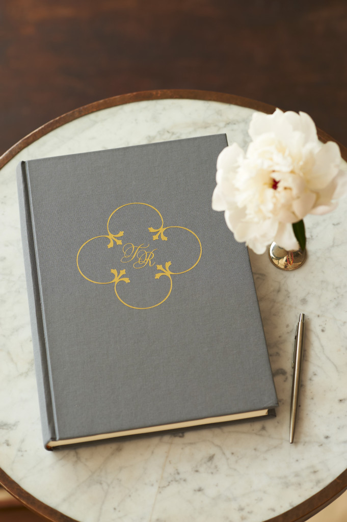
  I was pleasantly surprised to see the calligraphy initials that I created for their names, foiled into the cover of Tiler and Robbie’s Guest Book.

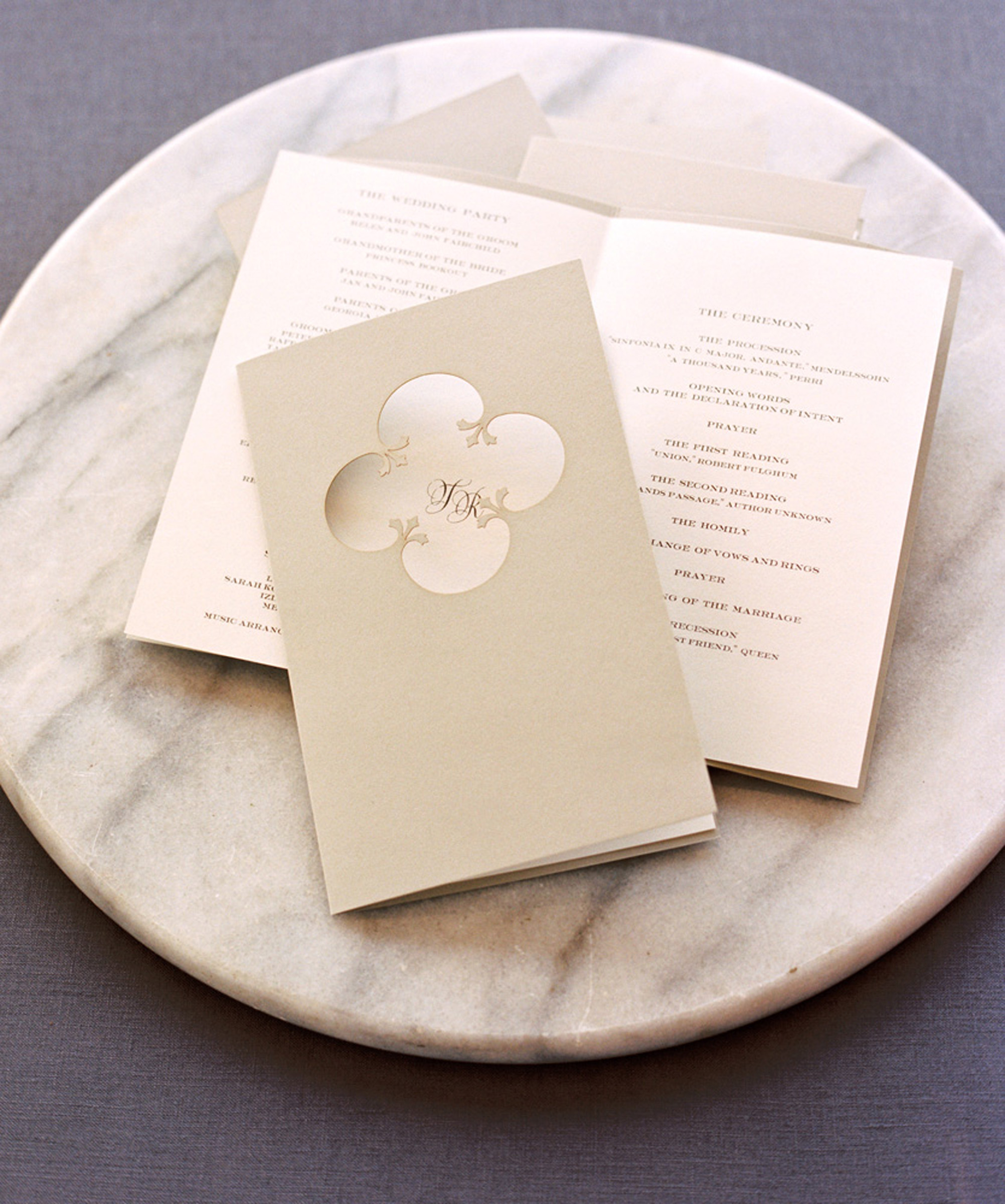
The initials also appeared on their peekabo wedding programs. Again, the symbol from the Cathedral floor the cut-out on the cover.

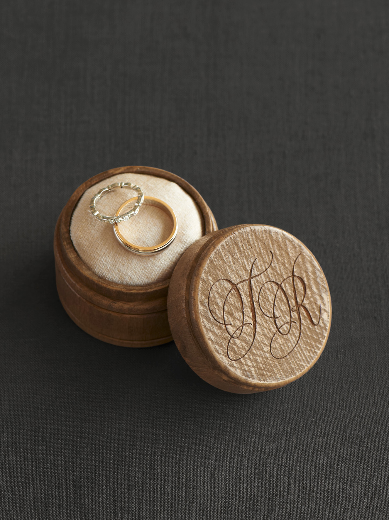
Another surprise was to see the calligraphy delicately carved into the lid of the wedding ring box below. How sweet is this!?

The table numbers came towards the end of our project. Tiler and Robbie had the originals. I scanned them, so that both Sue and I could reproduce the table numbers, in case others wanted to use them. My Epson printer prints on two sided digital Entrada fine art paper, so it is easy enough to do.
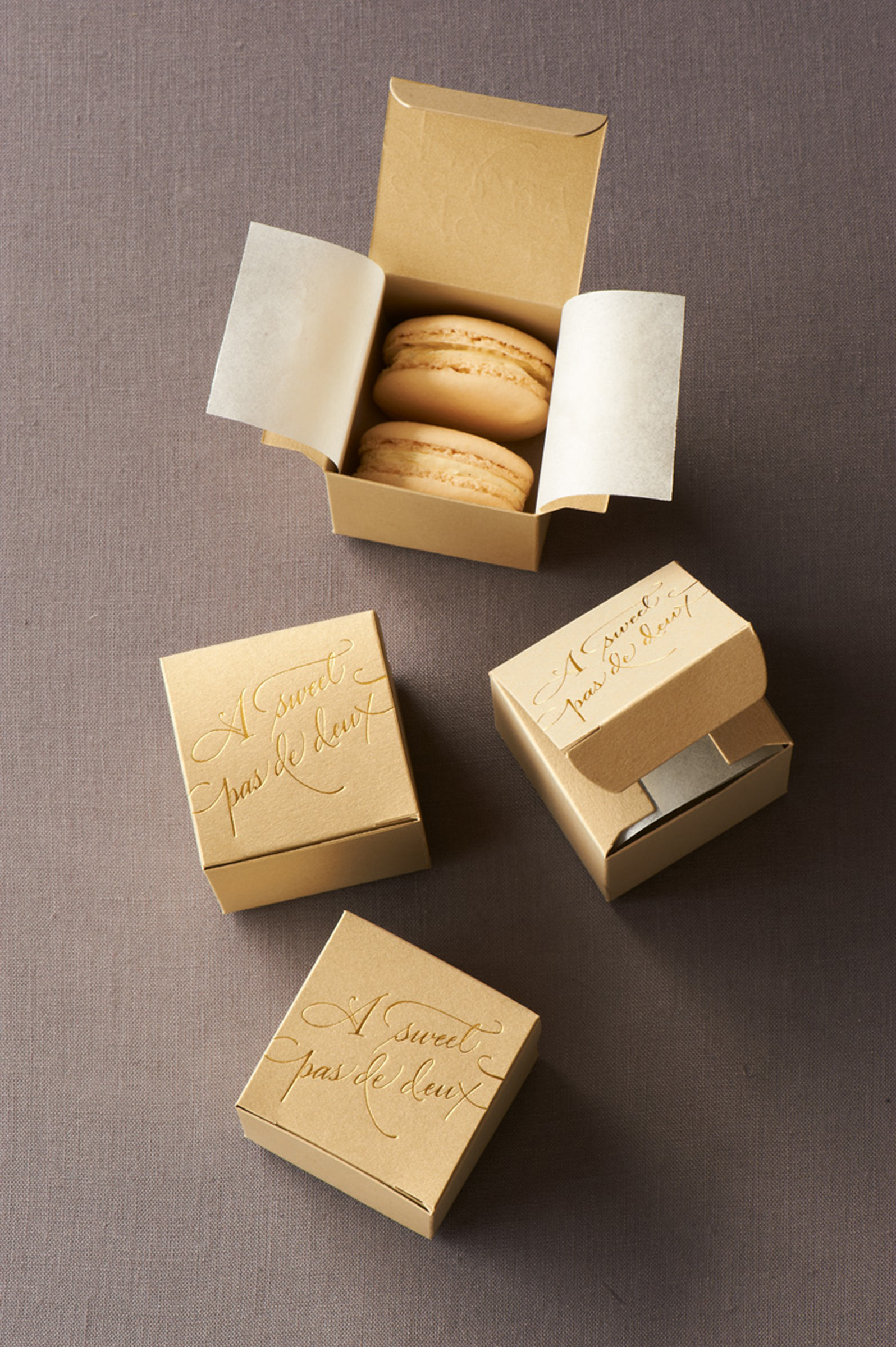
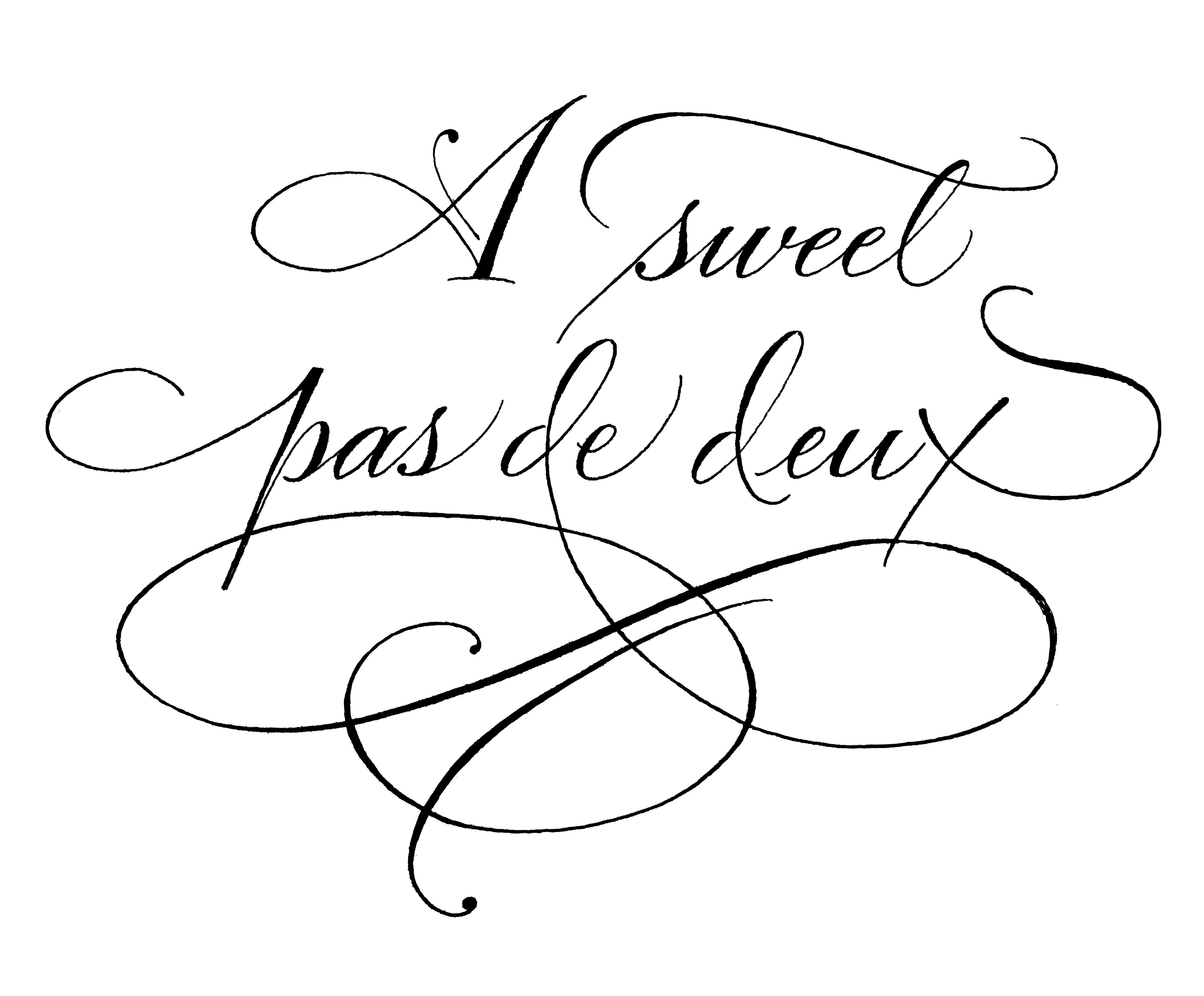
 The wedding favors, were two special little cookies in a box, that the Martha Stewart Weddings people hired out. My lettering did include a flourish, which I thought for sure would be perfect for a ballerina wedding. I had envisioned them reducing the design so it would fit on the box. Instead, it was removed. Nevertheless, I’ll show you! It’s below the last picture in this blog.
To see all of the wedding credits and pictures, go to www.MarthaStewartWeddings.com 20th Anniversary Edition > Tiler and Robbie wedding > Slide show > page 44, to see all of the fabulous people who helped to make their wedding a day to remember.

May these two beautiful ballet dancers, live happily ever after. What a fabulous couple they are…with a bright future! 
 Again, check us out: Calligraphy: Holly V. Monroe, Stationary Design: Sue Corral, and Photography: Charlotte Jenks Lewis
