Painting on Church Walls #2 – Evangelical Community Church, Cincinnati

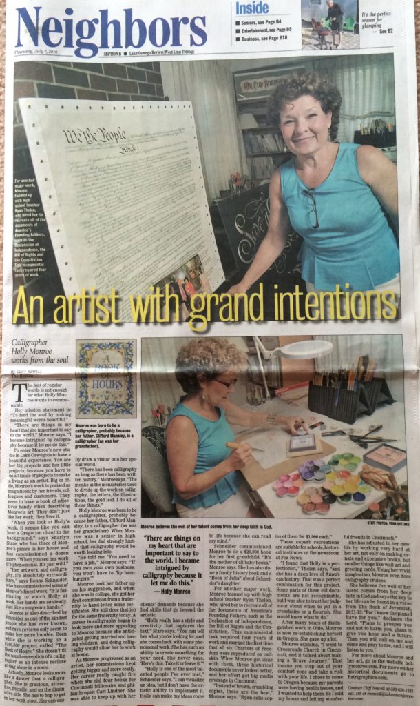
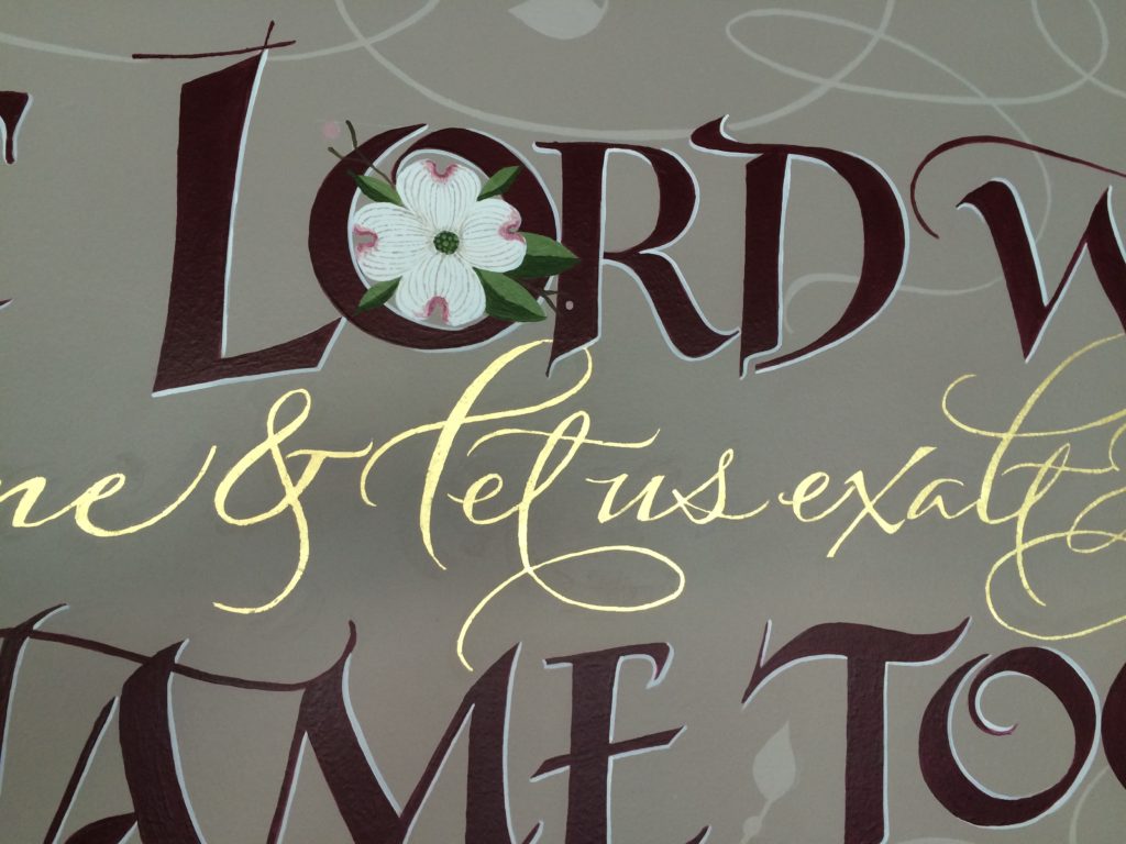
It had been my hope to venture back to my former Midwest town of Cincinnati, where I had developed my calligraphy business over 38 years. Am I really that old? Geesh! The Evangelical Community Church, on Struble Road made that possible when they invited me to create a design for Psalm 34:3 that would set the tone for worship as people came through the sanctuary doors. “O magnify the Lord with me and let us exalt His name together.” Read on for the process report.

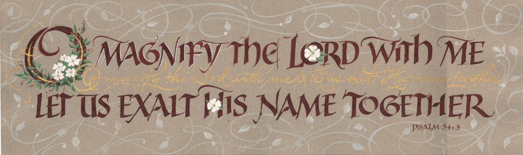
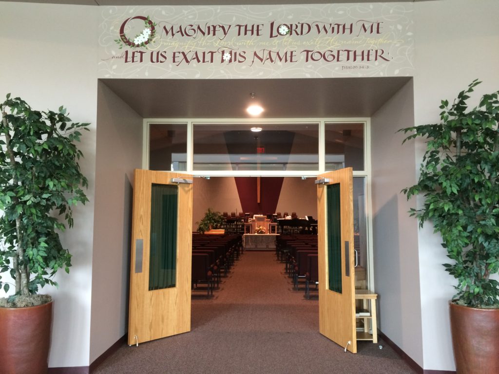
Before I explain this calligraphic adventure, here is the wall in it’s finished form….ecc9finalcloseup

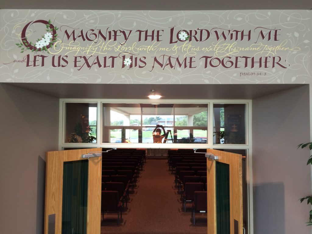
This is for you calligraphers and others who want to get a glimpse of the process.  The struggle. The birth of a design. It is tough to show you all of my roughs as I had about 100+ scans and photos in all. Some were pieced together in Photoshop because the roughs were bigger than my scanner.  This first one was the initial sketch. Three lines that weren’t reading right. Ohhh, I didn’t like this one at all, but I had to start somewhere. The church committee wanted 2 lines, legible, traditional. This one was rejected as were a number of other sketches.

omagnify1_pencil

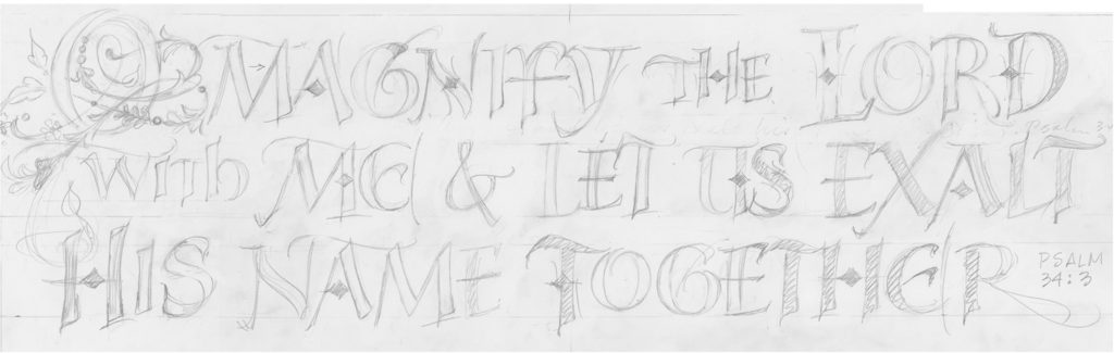
So I tried 2 lines of caps with a line of script, repeating the Psalm, for interest and to fill out the 3’x10′ wall . They wanted all of the E’s to be the same. I had rounded and squared E’s here. More revision.

omagnify_revised2b-copy

I tried a completely different lettering style, more contemporary with simple Rose of Sharon flowers. But the committee wanted Dogwood flowers and didn’t like this chunkier lettering style.

omagnify2_6x20

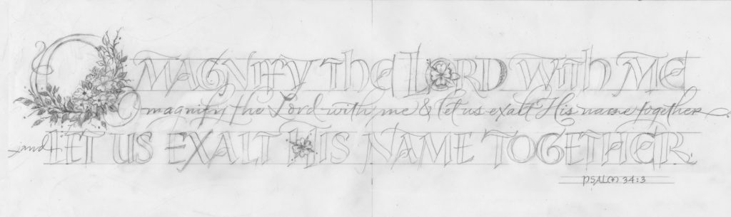
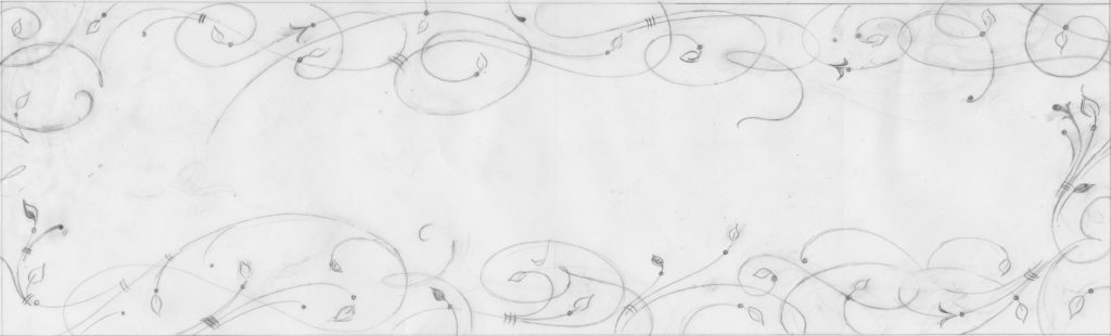
In this version, I revised the dogwood flowers from 5 to 3 in the capital O, but I had too many leaves that didn’t flow well. Since the wall area was a defined space, the flourishes seemed haphazard and incomplete.

omagnify_flowers2

I thought a little further….I decided to as Diana Wood said, ‘create a nest of flourishes for the words to sit in.’

omagnify_flourishes2bcrop

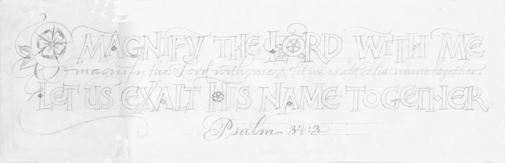
Then I added them to the artwork in Photoshop. I revised the script line. The committee saw this, but couldn’t imagine it without the color. I did a color rough (these are a little out of order…the color rough came when I had 5 flowers in the O, but that showed me that I didn’t want 5 flowers, they were too small).

omagnify_finala2wordsflou

I went to Sherwin-Williams and made a paint chart. I used some of these colors, eliminated what I could, mixed the brown from the red and green and at the last minute added Temperate Taupe for the background flourishes. Whew! I think I used 7 colors total, plus 24k gold leaf. omagnify_colors1

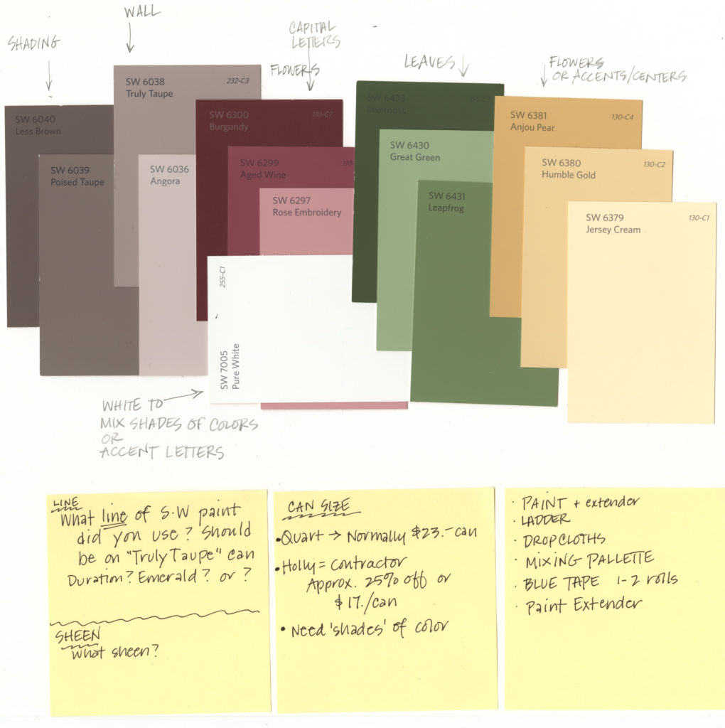
Then, I used my WN gouache to imitate some of the SW colors that I chose and mocked up this rough on handmade paper. It helped the committee visualize and also showed me what I needed to revise.

omagnify_colorfull

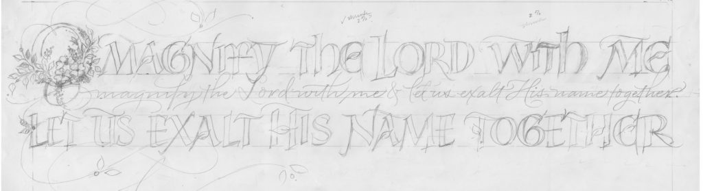
You can see in the Fedex enlargement below, I had a few more pencil revisions and then this became the final design. Since I thought that the wall space was 3’x10′, Fedex’s 3′ wide roll paper enlargement was perfect, so I printed in Oregon. The only problem was, the space was not measured exactly and when I got there, the wall space was 30″ x 10’6″. Fortunately, I have an account with Fedex, the design was uploaded on their site and I could reprint in Cincinnati. I shrunk the design by about 5% so that it would fit the space.

ecc1aenlargementfedex

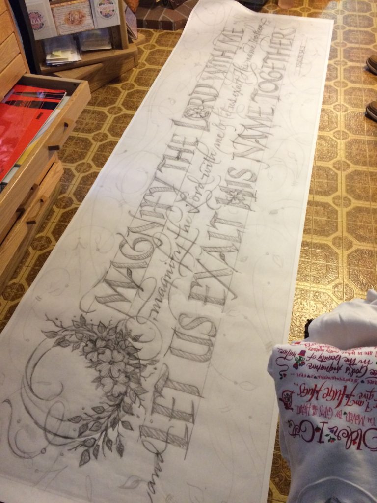
I taped up a 12″x11′ strip of white Saral transfer paper and penciled over the enlarged design, shifting the Saral paper down as I went. I could have bought 3 rolls, but was I was a cheapskate. The design transferred beautifully to the wall, so that I could see where I was going to letter & paint.

ecc1hollywalls

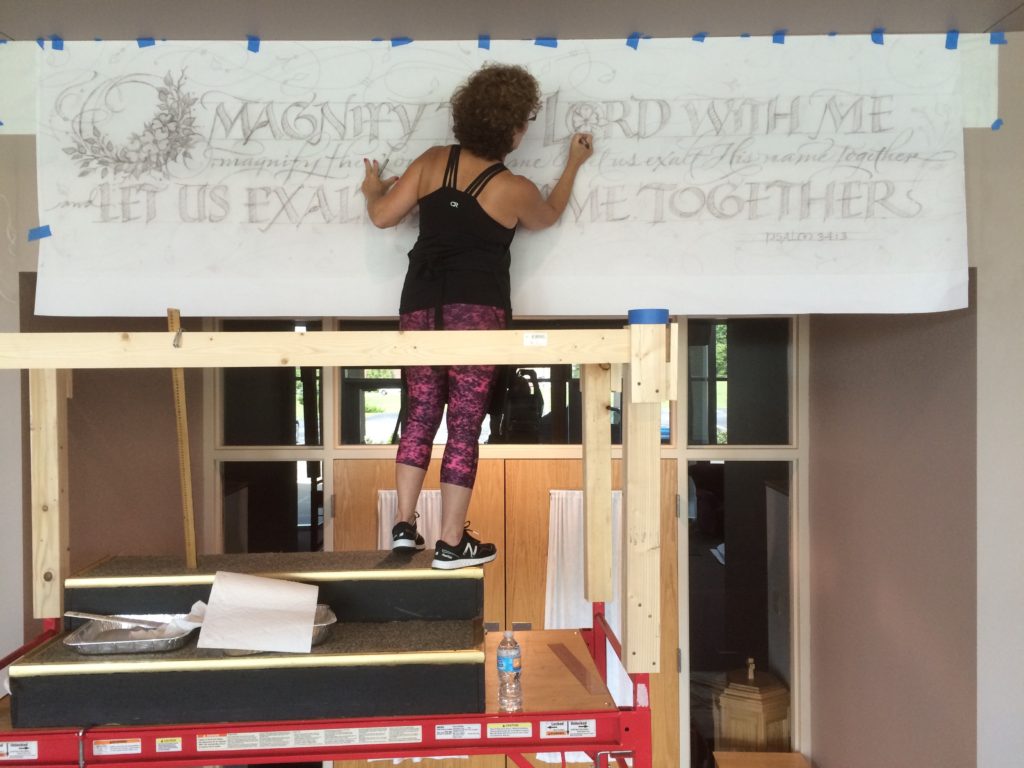
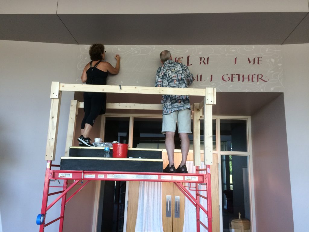
Saturday, September 3rd,  the painting began. I painted the background flourishes first. Temperate Taupe on top of  Truly Taupe. Just one shade away from each other. On Sunday, my friend David Ogden arrived to help me begin painting the letters. I was training myself to accept assistance on my design. David knows his letterforms well, so I trusted his expertise. Since we needed two layers of the  paint on everything, his help made it possible for me to finish on time. Sure looks like the Wheel of Fortune game in this picture!

ecc2hollydavidwalls

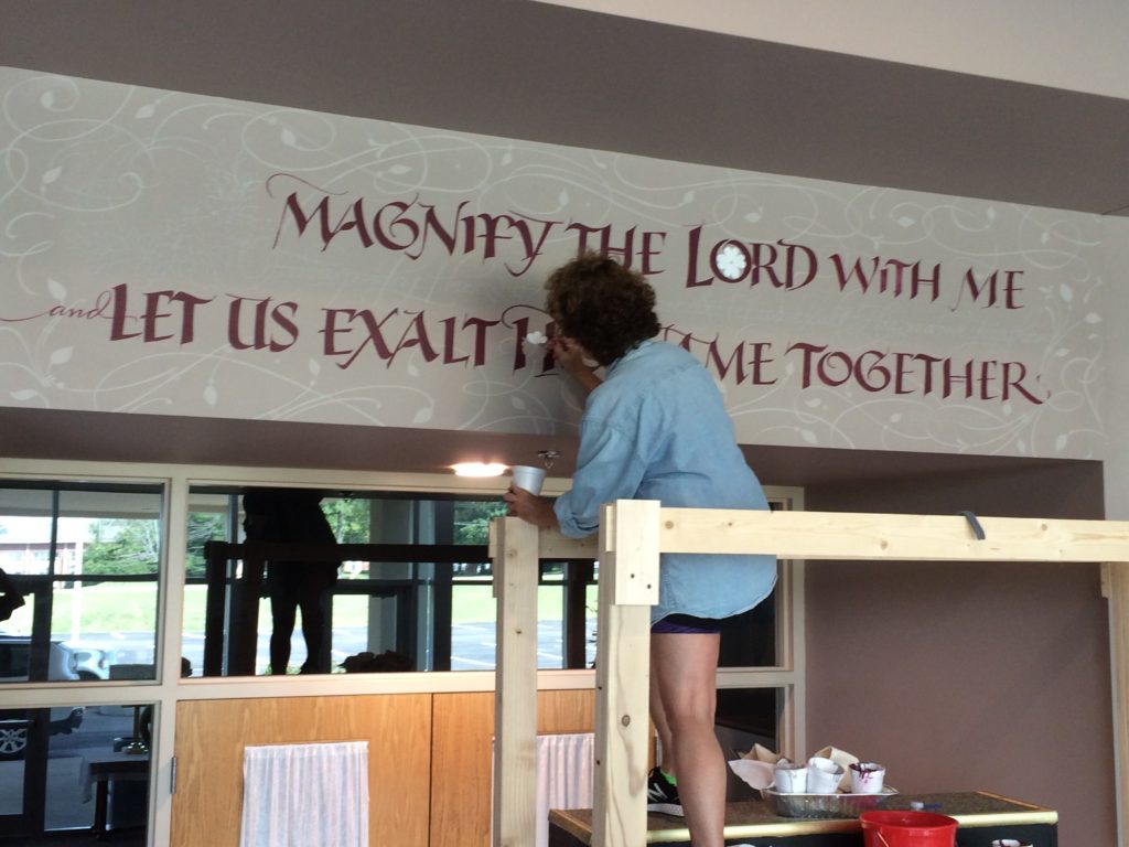
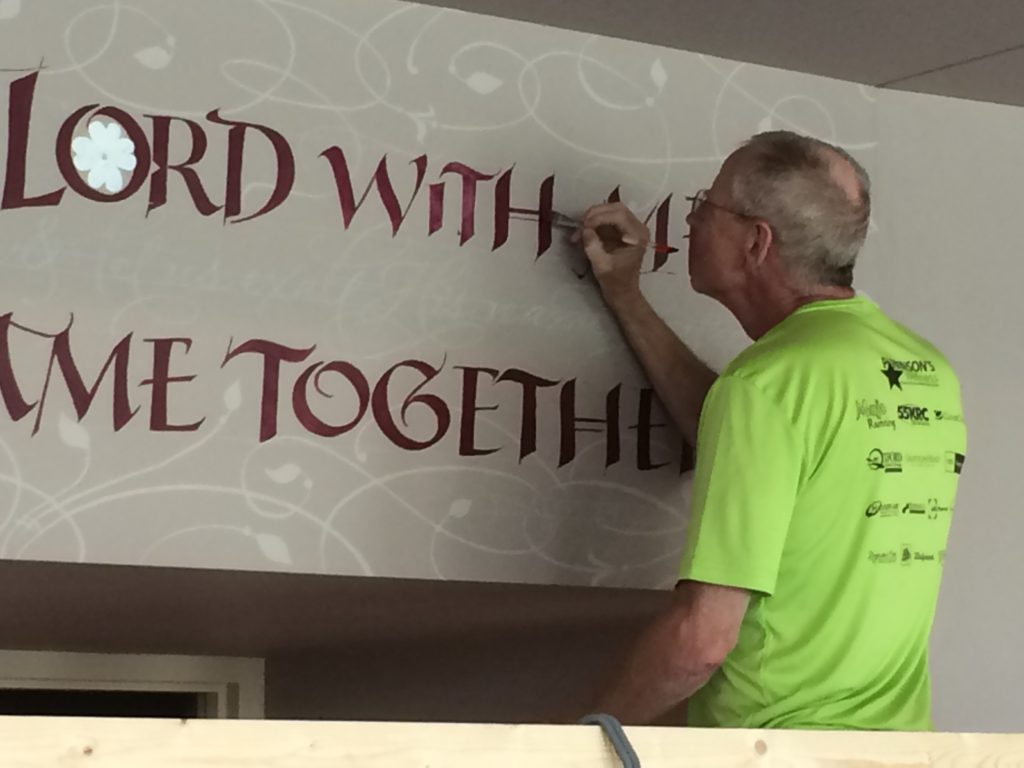
The painting progressed…..

ecc3holly

ecc4david

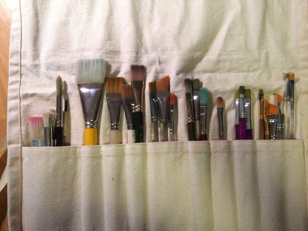
I found that I needed to buy a few additional pointed brushes in addition to the flat brushes I took.

flatbrushes

Then I laid the Gold Size for the ‘loose’ gold leaf lettering. Sorry, no picture. It was hard to see on the wall. I ran into a problem with the gold leaf. This was the first time I lettered a line of script on a wall and applied leaf to it. (I laid leaf in larger areas on the wall at Northminster Presbyterian w/o a problem). The gold leaf stuck to the wall, I needed precision. Ugh! I called my life lines….Jerry Tresser suggested ‘resist’, but that would take a long time and I had a plane to catch at the end of the week. David brought patent gold leaf, but it was a different color and not as shiny. I opted to carefully paint over the excess gold leaf, outlining the gold letters. This problem added 8 hours to my work. After speaking with Lee Littlewood in Oregon, he suggested that the next time, I powder Kaolin on the wall so that the gold doesn’t stick. I’m so used to laying gold leaf with gesso on vellum that I had not run into this problem before. Live and learn!

ecc5goldstickingonwallecc11goldlordcloseup

The capital O with the flowers was painted in with some  detail….ecc10flowerscloseup
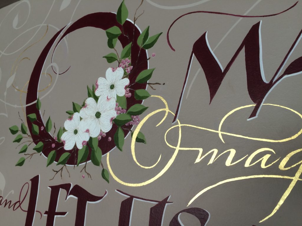
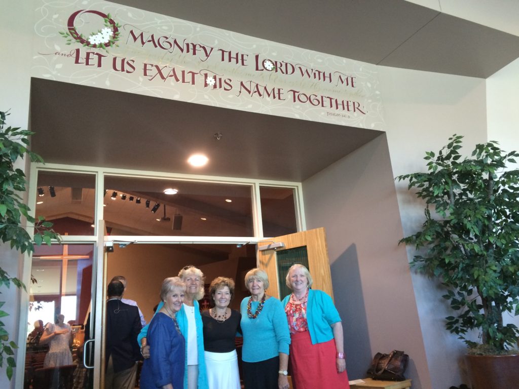
And voila, after about 3-4 weeks of labor (2+ design weeks, 6 painting days plus travel time), the wall was finished!  I am grateful to Diana Wood for her thorough and patient communication as she headed up the project, Joyce Williamson for the airfare, Sue Crosset for a private bed, bath, breakfasts & extra brushes, Donna & Gail the other two committee members, John & Judy Gould for a snappy little orange Subaru which gave me transportation all week, Otto for all of the facility arrangements and safety structure on the scaffolding, lunches and friendship from church members all week…I don’t remember all of the names…Jack & Linda Young, Sandy Irwin, Amy Kindell, Charlie and Jan Mahler and others. You were all so supportive – a BIG thank you!

img_6450
ecc9finalcloseup

The Evangelical Community Church committee that worked with me. Sue Crosset, Donna Peterson, Me, Gail Suiter and Diana Woods.

eccommittee

If you would like to see my first Church wall project, click on this link > PAINTING ON CHURCH WALLS #1 – Northminster Presbyterian, Cincinnati, OH

A New Calligrapher in Town!

Two weeks ago,  I had the privilege of an interview with reporter Cliff Newell of the Lake Oswego Review, in my Oregon calligraphy studio. I am grateful for the thorough job he did, covering creative project highlights, a little history and some of my soulful thinking! A huge thank you to Sharlyn Stare, Ryan Thelen and Ronna Schneider for taking the time with Cliff to add their kind-hearted insights about my work.  Trusty photographer Vern Uyetake came, as well, and snapped an interesting array of photos in my studio. Below find the digital article and the paper article. Content is the same, but the photos in the articles are slightly different.

First the digital Article: (you can read the content here a little easier).

“An Artist With Grand Intentions”

Secondly, the real deal in the newspaper: July 7, 2016

IMG_5948

SpeedBall Textbook 24th Edition, Celebrating 100 Years

It’s Easter, and I’m late with this news, but last November 2015, just after I moved from Ohio to Oregon, the Centennial Edition of the Speedball Textbook, A Comprehensive Guide to Pen & Brush Lettering, 24th Edition, finally hit the market! Yah! My father Cliff Mansley, Sr. and I are both honored and grateful to be included among so many accomplished and inspiring lettering artists. I snapped a photo of our pages below and offer you a brief description, plus links to purchase the book.

Speedball Textbook, 24th Edition in which Holly Monroe and Cliff Mansley are both featured.

Holly Monroe and Cliff Mansley, Sr. showing off the cover of the 2015 Speedball Textbook, 24th Edition in which they are both featured.

For a little $15. book the Speedball Textbook, 24th Edition packs a big punch. Students of the written word can see a wide variety of lettering styles as well as fabulous finished examples from contemporary calligraphers of today. The added bonus in this edition, edited by Angela Vandalis and Randal Hasson, is that it salutes lettering throughout the last 100 years.

Speedball Textbook 24th Ed, Cliff Mansley calligraphy of I Corinthians 13

Love bears all things from I Cor 13. Cliff Mansley’s calligraphy in the Speedball Textbook, 24th Ed.

In the front you’ll find a fold out page featuring the covers of 24 past editions of the Speedball Textbook. It moves on to Tools, Tips and Techniques, lettering styles through the ages (pointed pen, broad-edged, brush, hand drawn, etc.), commercial lettering and so much more. If you’re a lover of letters you’ll want a copy! Order from www.JohnNealBooks.com or www.PaperInkArts.com two small businesses that cater to the Lettering and Book Arts community.

Speedball Textbook 24th Ed with Cliff Mansley flourished title

Bottom right: Flourished title of a poem about Scout Leader’s Wives. Lettering/Flourishing by Cliff Mansley, Sr.

Speedball Textbook 24th Edition featuring Holly Monroe's flourishing instructions.

Holly Monroe’s mini-course in flourishing appearing in the Speedball Textbook, 24th Edition, 2015, page 55. For a more comprehensive weekend workshop, FANTASTIC FLOURISHES, contact Letters@HollyMonroe.com.

Calligraphy Carved in Wood, Stone and Slate

It all started with the wedding box. My son Josh started his Heirloom Artists Furniture Studio, now working from New Hampshire. Amy Smolen, a dear friend of his wife, Emily’s asked him to design a wedding box for her upcoming wedding. They wanted their names carved in it. Of course, Josh’s thinking went to calligrapher Mom – Holly, me! So while I was on snowy visit with Josh and Emily, I sat by the fire and sketched the names for the box. Because Josh was hand carving this box, the outline was all that was needed.SmolenAmyGregory2aAfter Josh carved it in wood, he built the box…..

10854390_436408929857308_1943359241575528959_o

 Put a finish on it and took on his first gold leaf project. A few tips from Mom, but he forged ahead on his own.

WeddingBox

He then put an additional finish on the box. Once that was on it, the little flecks of stray gold didn’t show. All that effort took hours to carve, build, finish and lay gold. It drove him to the purchase of a machine that we can program to carve the lettering or images into wood, slate or stone. Yahhhh!  I’m excited.

IMG_4038Here are a few mock ups we put together. The machine should arrive in late May 2015. This mock up shows how slate might look with a Music quote on it.

Music2BWThis wood mock up shows one of Holly’s calligram’s….Horse Sense. (I have a Dog and a Cat, too.) Either a paper reproduction frame for your home or….how about this wood design for your barn? CaptureLastly, although I didn’t create these designs, this shows you how beautiful carved stone is. Great for outdoor signs, indoor artwork…family logo or monogram? The options are endless. I can’t wait to get started with Josh! And yes, we can lay gold leaf in the lettering of your project. Let us know when you have something in mind! 51077

Calligraphy Cruise February 2016 to the Western Caribbean

2016CalligraphyCruise_WEB


Come join me and others as we sail to the Caribbean for fun, sun and to enhance your calligraphy repertoire of skills. Calligraphers and NON-Calligraphers, all welcome -Friends and Relatives, spouses and significant others. We are changing cruise lines this time to Royal Caribbean as Holland America sold out the route and week we initially chose. Details are on my flyer above, which can currently be seen on my FB page and in the SHOP on my website. Correct information will soon appear on my CLASSES section. The wrong date is on my Home page and will be corrected. The correct sailing dates are February 20-27, 2016.

                              $100 deposit will hold your place in the class.                             Book early for best cabin selection.