Best of Show, Oregon State Fair

What a nice surprise! Last Friday night I was awarded Best of Show at the Oregon State Fair 2017, Calligraphy Division. The cash award made it an even sweeter win.

To submit an entry to the Oregon State Fair, the calligraphy has to be created within the last 2 years. That is always a challenge for me, since so much of my work goes directly to my clients. My assistant, Heather Barton (who is also a calligrapher and prize winner), remembered that I had the ‘Achiever’ original remaining…..scroll down….

Reproductions are available!

‘Achiever’ was a piece that I completed for Mason, Ohio, client Dawn Shiver this past winter. She and her husband own Shiver Security Systems, Inc. in Mason and were looking for some special awards for their top salesmen. Dawn commissioned me to rework the wording and create the artwork, which was later scanned, retouched, color altered and finally high end reproductions were printed one at a time from my Epson R3000 printer on Entrada digital paper. The original was created on D’Arches black 140# paper, with tinted Dr. Martin’s bleed proof white to help the capitals pop. Brown gouache was added to my gold Winsor New metallic gouache to give the script more of a bronzed look. Fabulous Frames in Cincinnati, enhanced the awards with beautiful frames. DesignSource in Oregon, framed the winning original.

Achiever, Best of Show, Oregon State Fair 2017

Achiever – Best of Show, Oregon State Fair 2017, Calligraphy Division

Bible Journaling

Cover of Bible Journaling Book Joanne Fink

Have you ever kept a diary or a journal?  You write your thoughts and experiences in a notebook in an effort to keep a record of your life…often to look back and marvel at the journey God has taken you on, or to pass down to the next generation. Bible Journaling is similar, only, as you read Scripture you pull out the phrases that are most meaningful to you, creatively illustrating and lettering them on pages of your Bible. The emphasis is definitely a memorable way to accent what God is impressing on your heart through His Word. (You can even purchase a new Bible that actually leaves space for your creations…if you don’t want to mark up your current Bible.)

Joanne Fink and Regina Yoder have kindly included some of my work in their new Bible Journaling paperback book, Fox Chapel Publishing, $19.99.  Click link to order. Read on…..

Their new book offers ‘how to’ instructions for design, illustration and lettering a Bible verse. They take you step by step, so whether you are a beginner or advanced, you have tips for making your pages meaningful, as well as attractive.  Included are sample pages from over 40 dedicated journalers, showing the diversity of artwork styles while offering inspiration for your pages. Below, see one spread from Karla Dornacher’s lovely section.

Friend and colleague, Joanne Fink decided to include some images from my collection, which expands the books’ focus from within the Bible pages, to lettering Scripture verses ‘Outside the Bible.’ In the section below, Joanne takes Proverbs 3:5-6 and compares the way that numerous artists, calligraphers or journaler’s have designed the same verse. See the book for the variety!

As you can guess, verses can be designed for greeting cards, framed art, books, walls of churches, businesses, homes, etc. You can choose where you want your art to appear – personally (in your Bible) or publicly. My focus has always been a more public application, since I have been active in business since around 1980. Below, you will see Bible Journaling’s two page spread of some of my work. On the left, it features my church wall work at Evangelical Community Church and Northminster Presbyterian Church, both in Cincinnati, OH and on the right page, 3 commissions in my collection. You will find larger pics and others in my www.HollyMonroe.com > SHOP+ > Prints > Scripture section of my website. Love and Serve, Know the Plans and Lord Provider, Jehovah Jirah.

Bible Journaling Joanne Fink Holly Monroe pages.

Two page spread of Holly Monroe’s calligraphy in new Bible Journaling book.

Lastly, I’m showing you the back cover of Joanne and Regina’s book, showing not only hand-created Bible pages from other artists, but also a list of the multitude of items included in their generous book. I believe this book will be an inspiration to adults and children, to artists/calligraphers/journal keepers who care about their walk with God, through His Word.

Bible Journaling Back Cover

Journaling has always been around, but artistic Bible Journaling is a new emphasis. I first encountered a similar type of this activity with friend and colleague Tim Botts, who would calligraphically illustrate a section of Scripture each morning, as he read his Bible. His sketches turned into his 20+ books, starting with “Doorposts” through Tyndale Book Publishers. Tim has certainly been an inspiration to me in my calligraphy career. Take a look at his work, if you haven’t discovered him yet!


SpeedBall Textbook 24th Edition, Celebrating 100 Years

It’s Easter, and I’m late with this news, but last November 2015, just after I moved from Ohio to Oregon, the Centennial Edition of the Speedball Textbook, A Comprehensive Guide to Pen & Brush Lettering, 24th Edition, finally hit the market! Yah! My father Cliff Mansley, Sr. and I are both honored and grateful to be included among so many accomplished and inspiring lettering artists. I snapped a photo of our pages below and offer you a brief description, plus links to purchase the book.

Speedball Textbook, 24th Edition in which Holly Monroe and Cliff Mansley are both featured.

Holly Monroe and Cliff Mansley, Sr. showing off the cover of the 2015 Speedball Textbook, 24th Edition in which they are both featured.

For a little $15. book the Speedball Textbook, 24th Edition packs a big punch. Students of the written word can see a wide variety of lettering styles as well as fabulous finished examples from contemporary calligraphers of today. The added bonus in this edition, edited by Angela Vandalis and Randal Hasson, is that it salutes lettering throughout the last 100 years.

Speedball Textbook 24th Ed, Cliff Mansley calligraphy of I Corinthians 13

Love bears all things from I Cor 13. Cliff Mansley’s calligraphy in the Speedball Textbook, 24th Ed.

In the front you’ll find a fold out page featuring the covers of 24 past editions of the Speedball Textbook. It moves on to Tools, Tips and Techniques, lettering styles through the ages (pointed pen, broad-edged, brush, hand drawn, etc.), commercial lettering and so much more. If you’re a lover of letters you’ll want a copy! Order from www.JohnNealBooks.com or www.PaperInkArts.com two small businesses that cater to the Lettering and Book Arts community.

Speedball Textbook 24th Ed with Cliff Mansley flourished title

Bottom right: Flourished title of a poem about Scout Leader’s Wives. Lettering/Flourishing by Cliff Mansley, Sr.

Speedball Textbook 24th Edition featuring Holly Monroe's flourishing instructions.

Holly Monroe’s mini-course in flourishing appearing in the Speedball Textbook, 24th Edition, 2015, page 55. For a more comprehensive weekend workshop, FANTASTIC FLOURISHES, contact Letters@HollyMonroe.com.

Calligraphy for the Ballerina Wedding

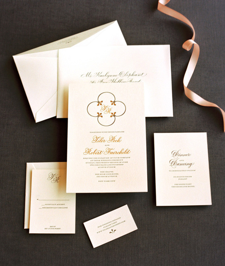
Last year, I was sitting at the drawing board, when Sue Corral called from www.DesignCorral.com  She had been at a speaking engagement in NYC, when the Martha Stewart Weddings people asked her to design the stationary for “The Ballerina Wedding.” Tiler Peck and Robbie Fairchild, the two principal dancers in the New York City Ballet, were getting married! Willingly, she submitted samples from several calligraphers to the ballerinas, and unbeknownst to me, mine had been selected! Tiler and Robbie wanted lettering that was traditional, tailored and elegant. I was honored. So Sue and I put our heads together to come up with something special. Sue, had the design reigns and sent multiple mockups, but the ballerinas had simple, elegant taste. They landed on one, that incorporated the motif from the Cathedral floor in the picture below. Enjoy the professional pictures taken by Photographer Charlotte Jenks Lewis, www.charlottejenkslewis.com

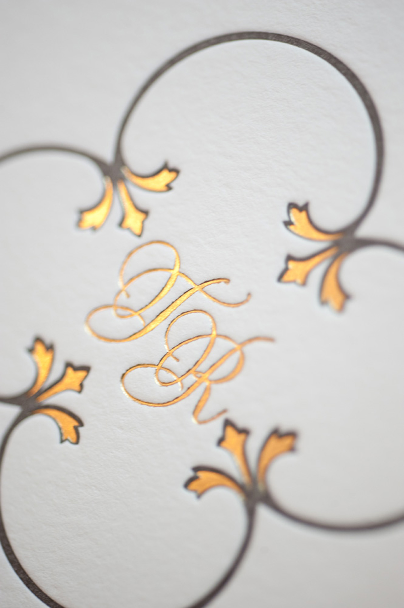
Both the lettering and the tri-floral ends of the design were letterpressed in gold foil. Originally, the calligraphy was created in black…

Invite-15-d21569Letterpressed type and “Dinner and Dancing” calligraphy was charcoal grey.invite-017-d21569
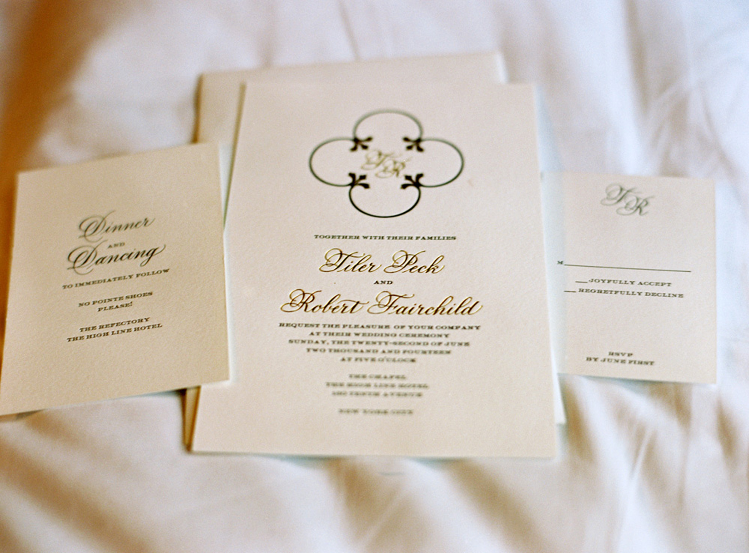
I am sharing a close up with you….one might think that the gold lettering is typeset,  the letterpress makes it look soooo perfect. But no, this was all done by hand at the drawing board, retouched in Photoshop and digitally transported to Sue. The calligraphy was much more delicate than it shows here. If you are not familiar with  letterpress, the process always thickens the intended fine lines.invite-1747-d21569invite-1750-d21569
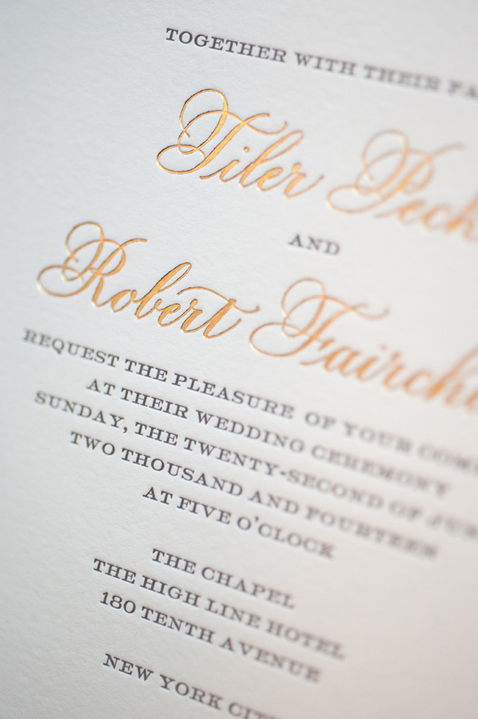
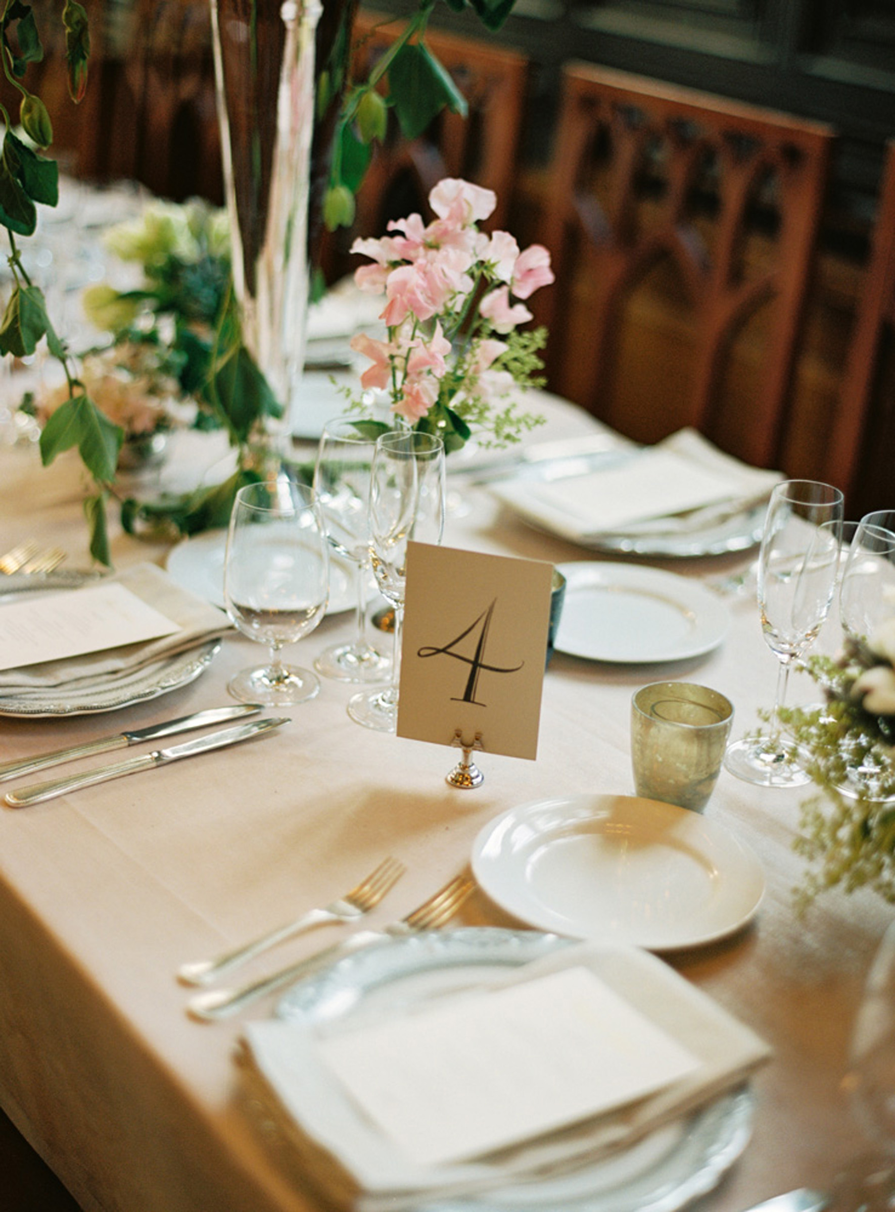
Menu’s were letterpressed via Sue, as well. In an effort to elegantly use the Menu as a Place Card, I was asked to personalize each one with gold gouache. I used FineTec gold, but have to say that the marriage between the paper and the gold was a delicate one. I painstakingly went over each name a second time, so that the hairlines would 1). show up better 2.) while not losing their delicacy…so had to keep a light tough. I achieved the look that I wanted. (Perhaps soon I will post a closeup of a few of those.) Here is their extraordinarily romantic table setting. CL44c46-R01-006
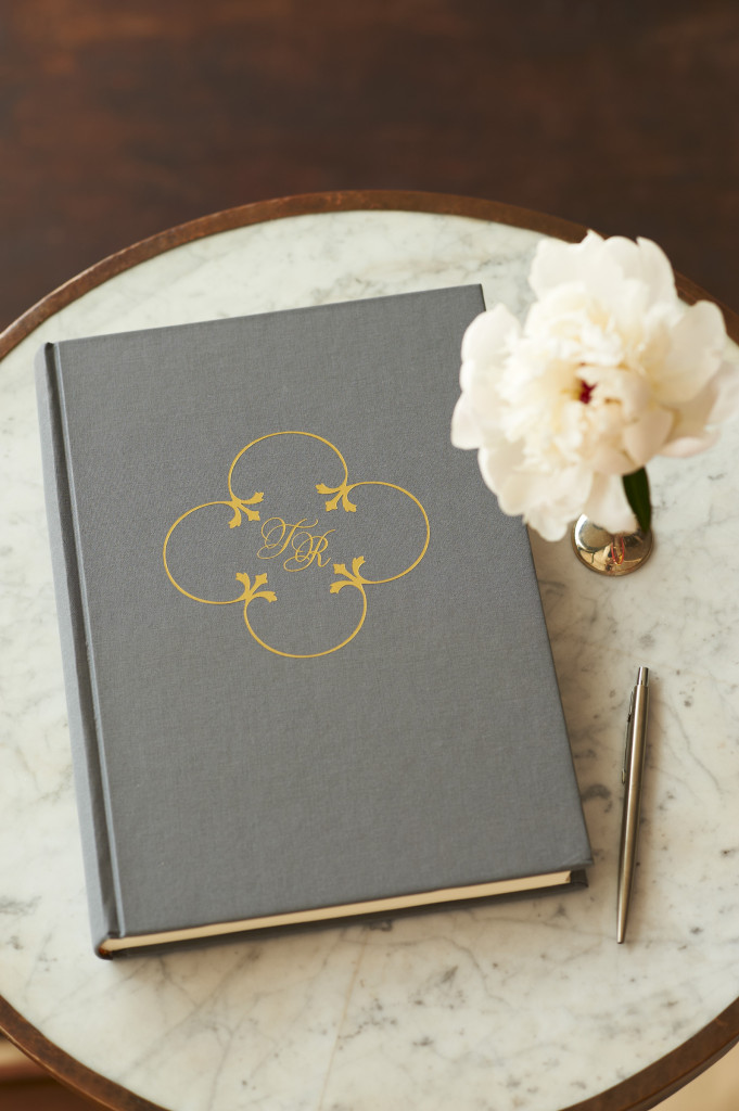
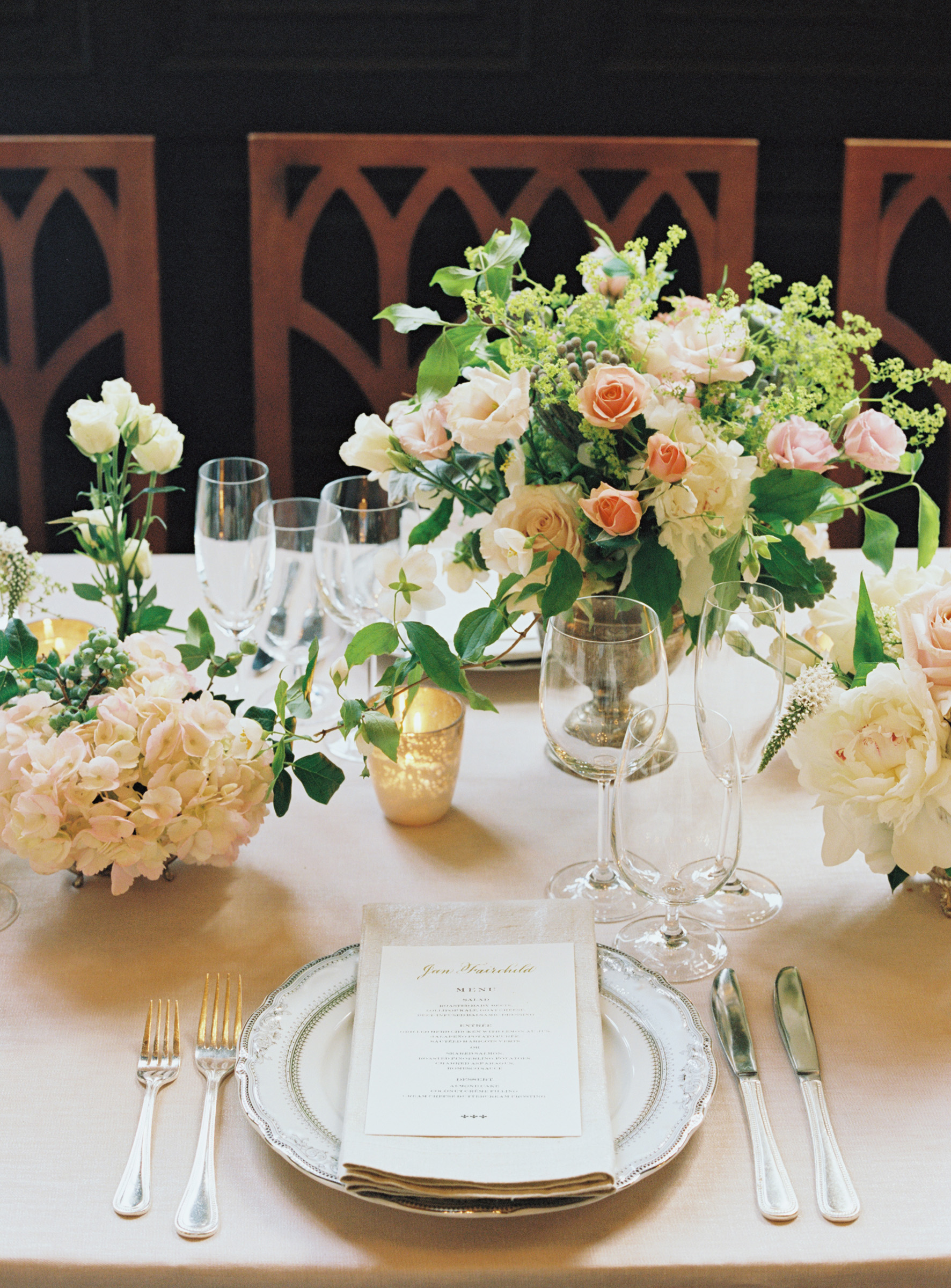
I was pleasantly surprised to see the calligraphy initials that I created for their names, foiled into the cover of Tiler and Robbie’s Guest Book. 
guestbook-004-d21569

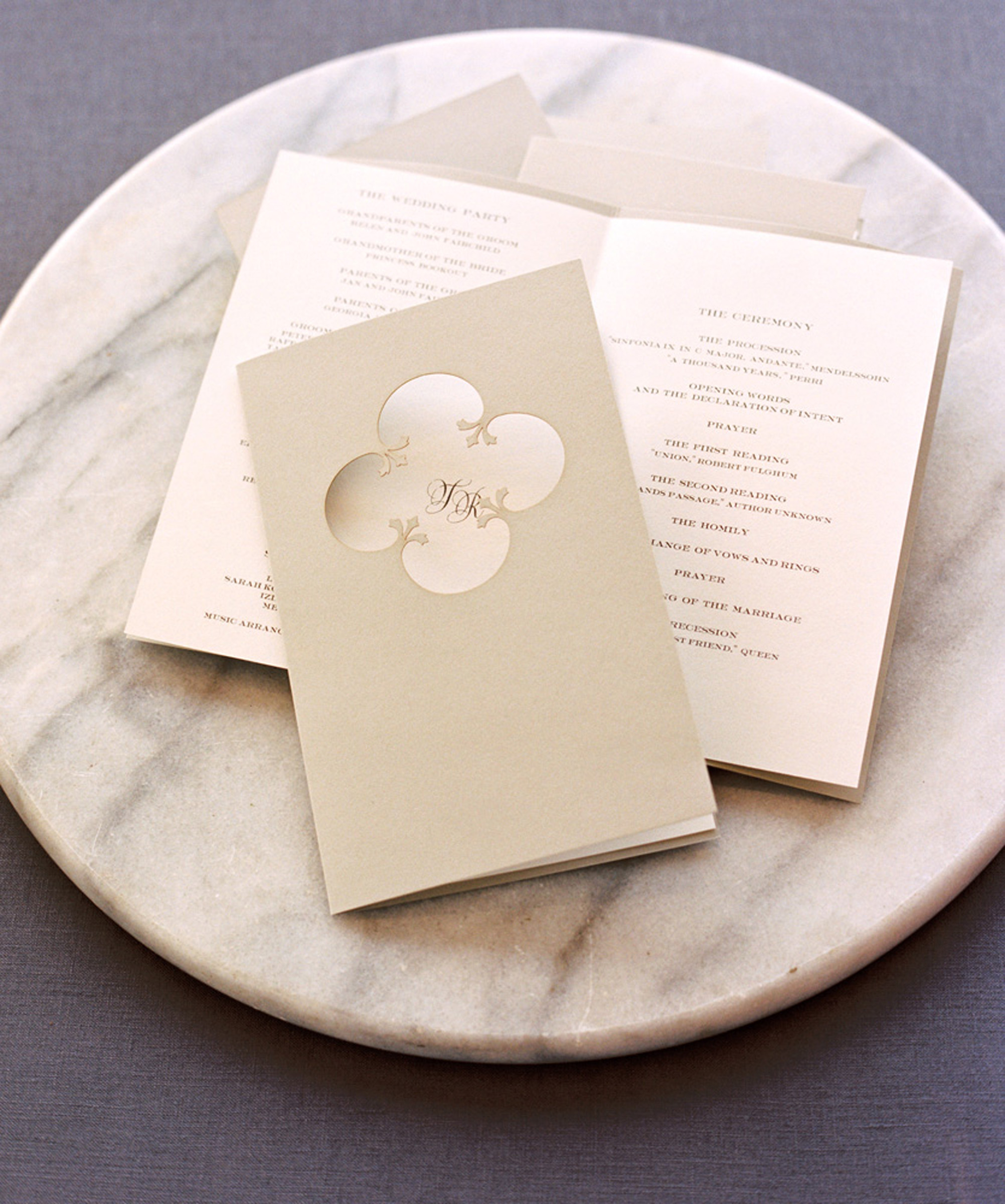
The initials also appeared on their peekabo wedding programs. Again, the symbol from the Cathedral floor the cut-out on the cover.

programs-2-d21569

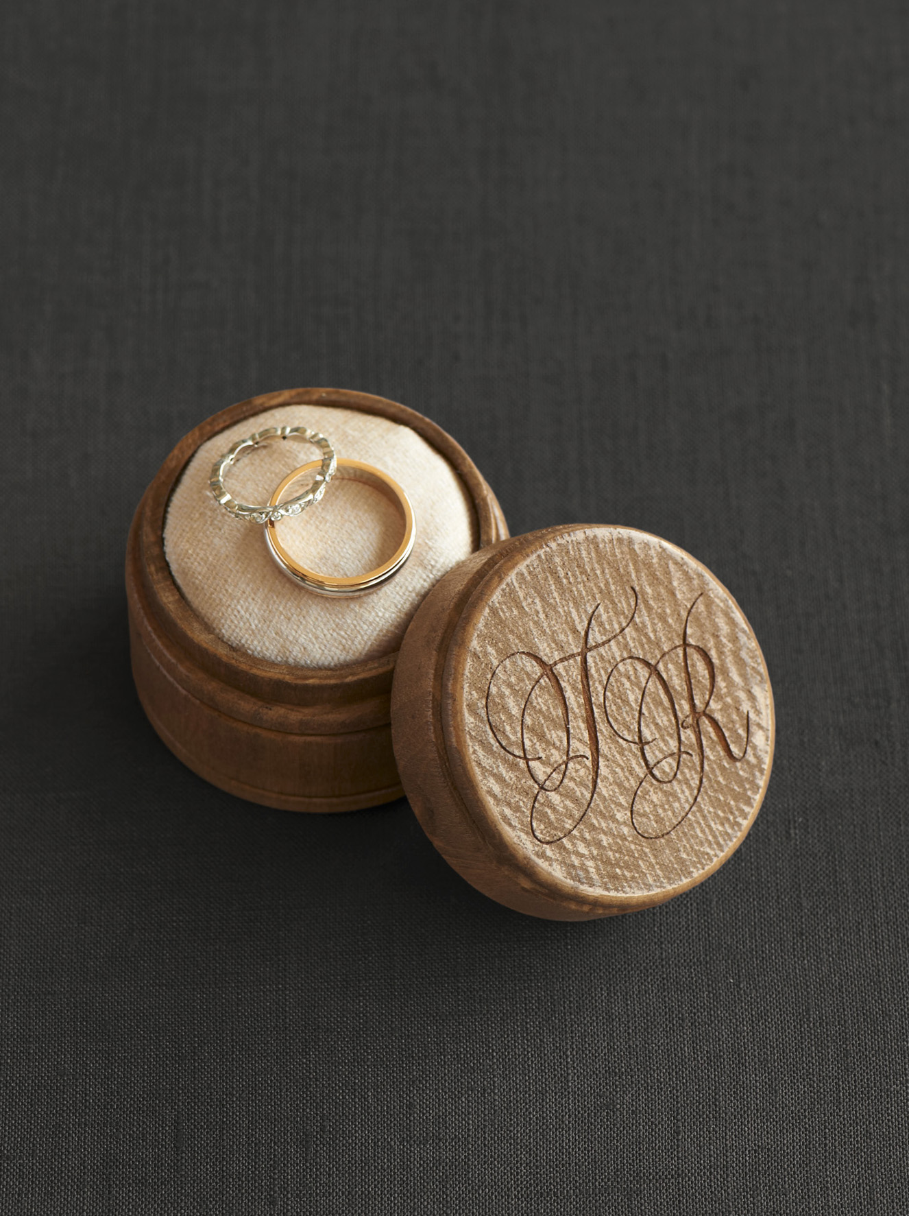
Another surprise was to see the calligraphy delicately carved into the lid of the wedding ring box below. How sweet is this!?

rings-018-d21569

The table numbers came towards the end of our project. Tiler and Robbie had the originals. I scanned them, so that both Sue and I could reproduce the table numbers, in case others wanted to use them. My Epson printer prints on two sided digital Entrada fine art paper, so it is easy enough to do.

theroom-032-d21569
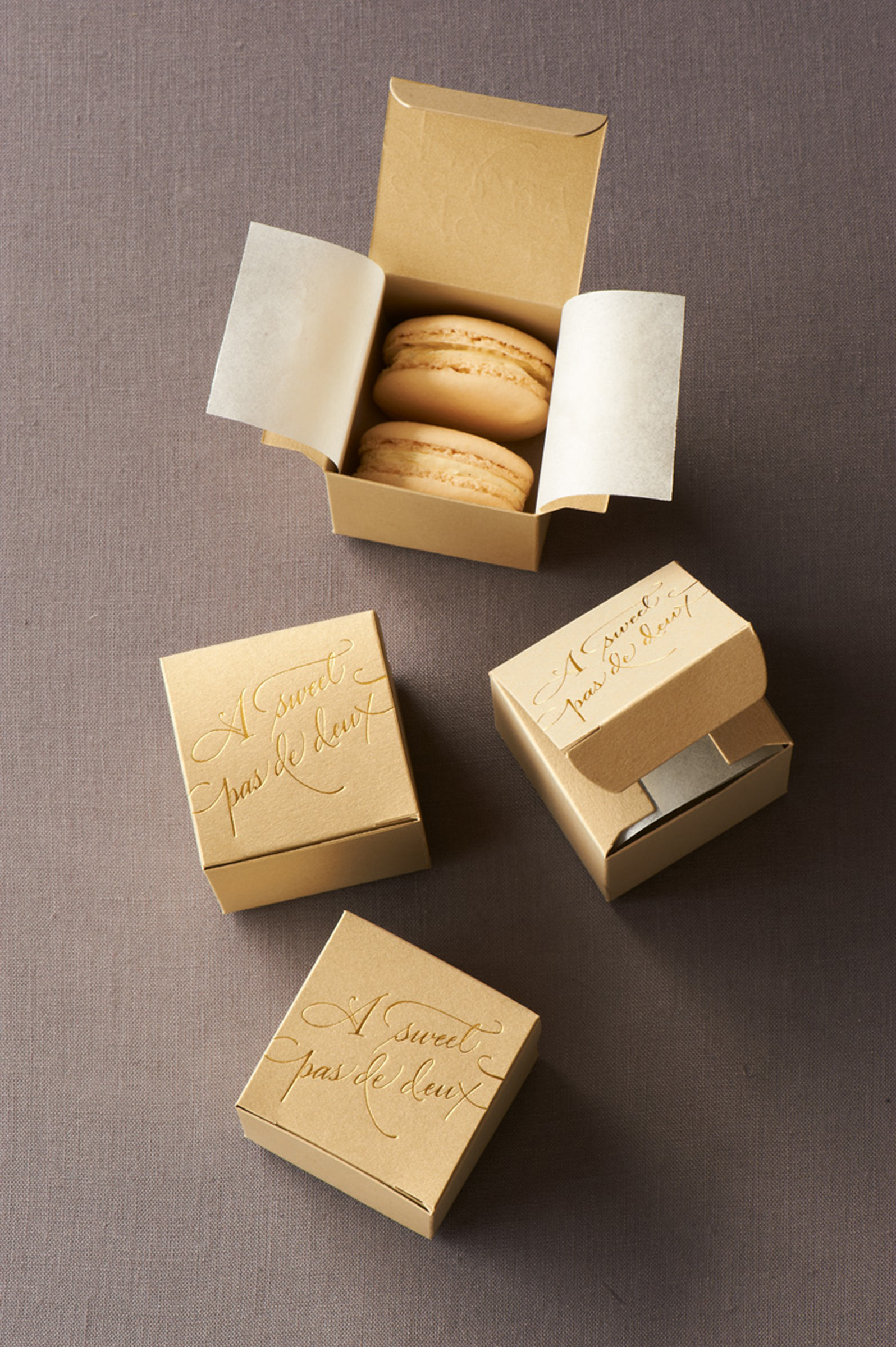
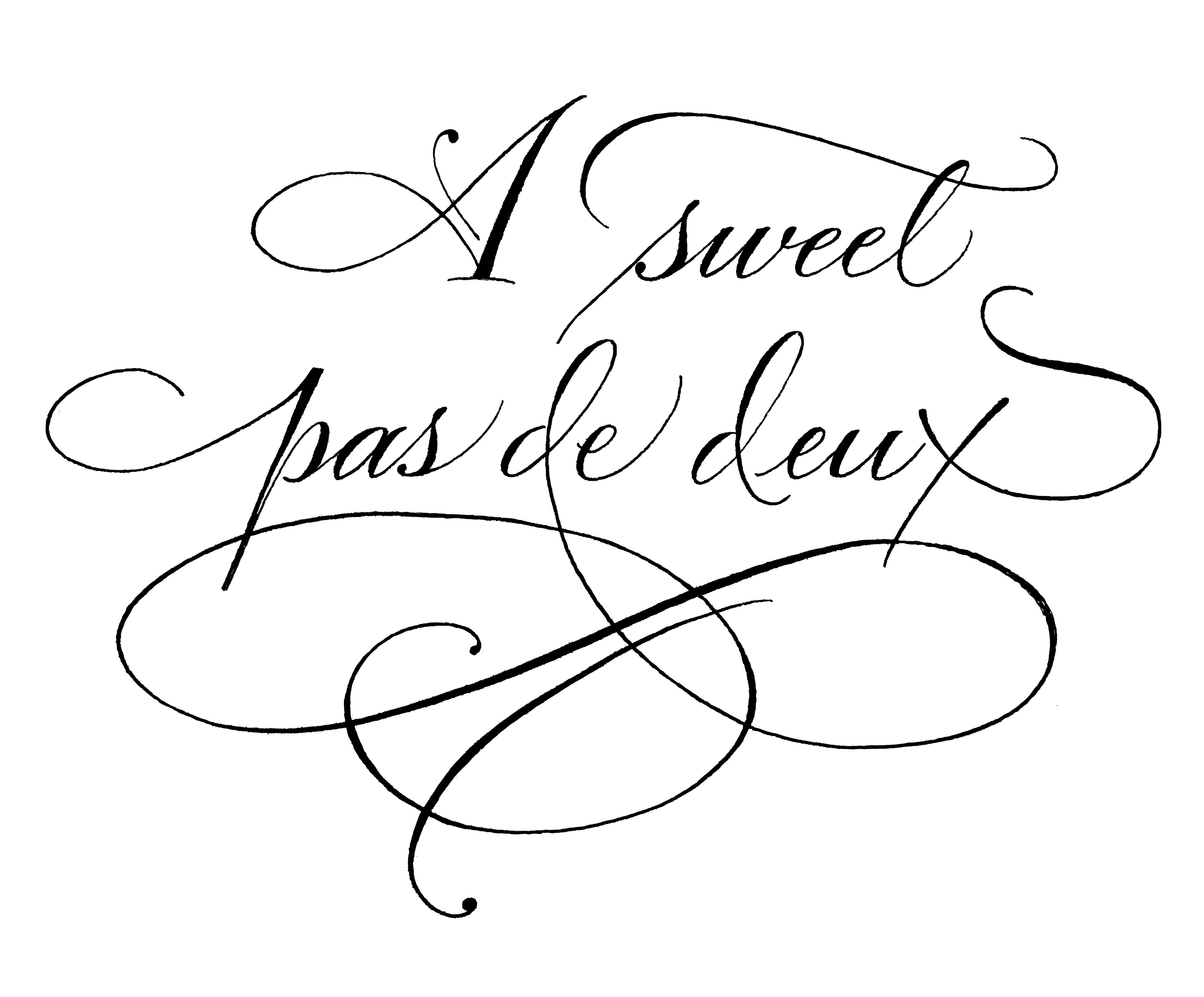
The wedding favors, were two special little cookies in a box, that the Martha Stewart Weddings people hired out. My lettering did include a flourish, which I thought for sure would be perfect for a ballerina wedding. I had envisioned them reducing the design so it would fit on the box. Instead, it was removed. Nevertheless, I’ll show you! It’s below the last picture in this blog.

To see all of the wedding credits and pictures, go to www.MarthaStewartWeddings.com 20th Anniversary Edition > Tiler and Robbie wedding > Slide show > page 44, to see all of the fabulous people who helped to make their wedding a day to remember.

favors-029-d21569

May these two beautiful ballet dancers, live happily ever after. What a fabulous couple they are…with a bright future! tiler-robbie-005-d21569 (2)ASweetPasDeDeux_1200Again, check us out: Calligraphy: Holly V. Monroe, Stationary Design: Sue Corral,  and Photography: Charlotte Jenks Lewis

Lighthouses & Basketballs

Fifteen Lighthouses for the Willmore Lange Reunion 2013

Fifteen Lighthouses for the Willmore Lange Reunion 2013

Just in case you think a calligraphy career is boring, take a look! You might find a few of my unique projects amusing!

Summer brings vacations and families together! Sharman Willmore brought me these 15 creative lighthouses to letter on. She will give one to each of the families attending their reunion, which is near the ‘real’ lighthouse. A great family memory. Her father built these approximately 15″ tall replica’s. I lettered the relaxed script with a miniature WN sable brush with yes, acrylic ink. Amazingly, the ink was kind to my brush!

And if those aren’t a unique enough request for you, two years ago, I lettered on 200 Basketballs….

 The BB's were lettered with Limited Edition numbers in preparation for Oscar Robertson's signaturesKatie Pavel, from University of Cincinnati’s Athletic Department, called me to letter the Limited Edition numbers on beaucoup Basketball’s to be signed by Oscar Robertson and given to UC’s athletic supporters. I was a tad disappointed when I learned that I was to letter them in Oscar’s presence at the game but then switched to a room in advance of the game, but such is life! This way, the ink was dry when he signed. It was a simple job, but great fun to have a change of scenery.OLYMPUS DIGITAL CAMERA

OLYMPUS DIGITAL CAMERACan you believe I ever finished? I used a broad-edged pen with acrylic ink and it took about 3.5 hours (everyone asks)! Below is Katie and her co-worker as they orchestrated the project.

OLYMPUS DIGITAL CAMERA